
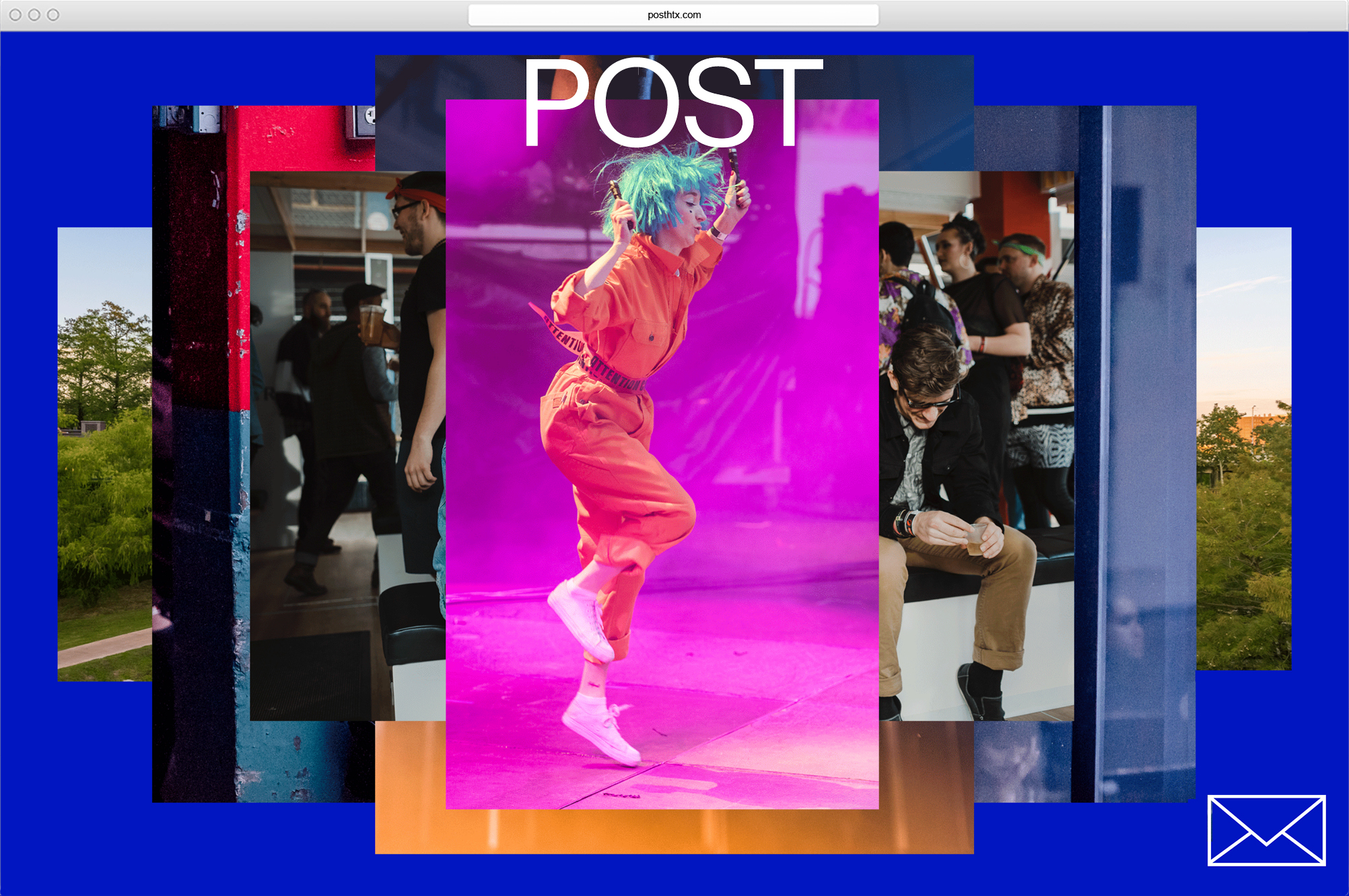

POST identity 
Client: Lovett Development
Implementation: Formation and Lovett Development
POST signage
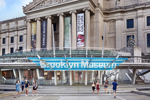
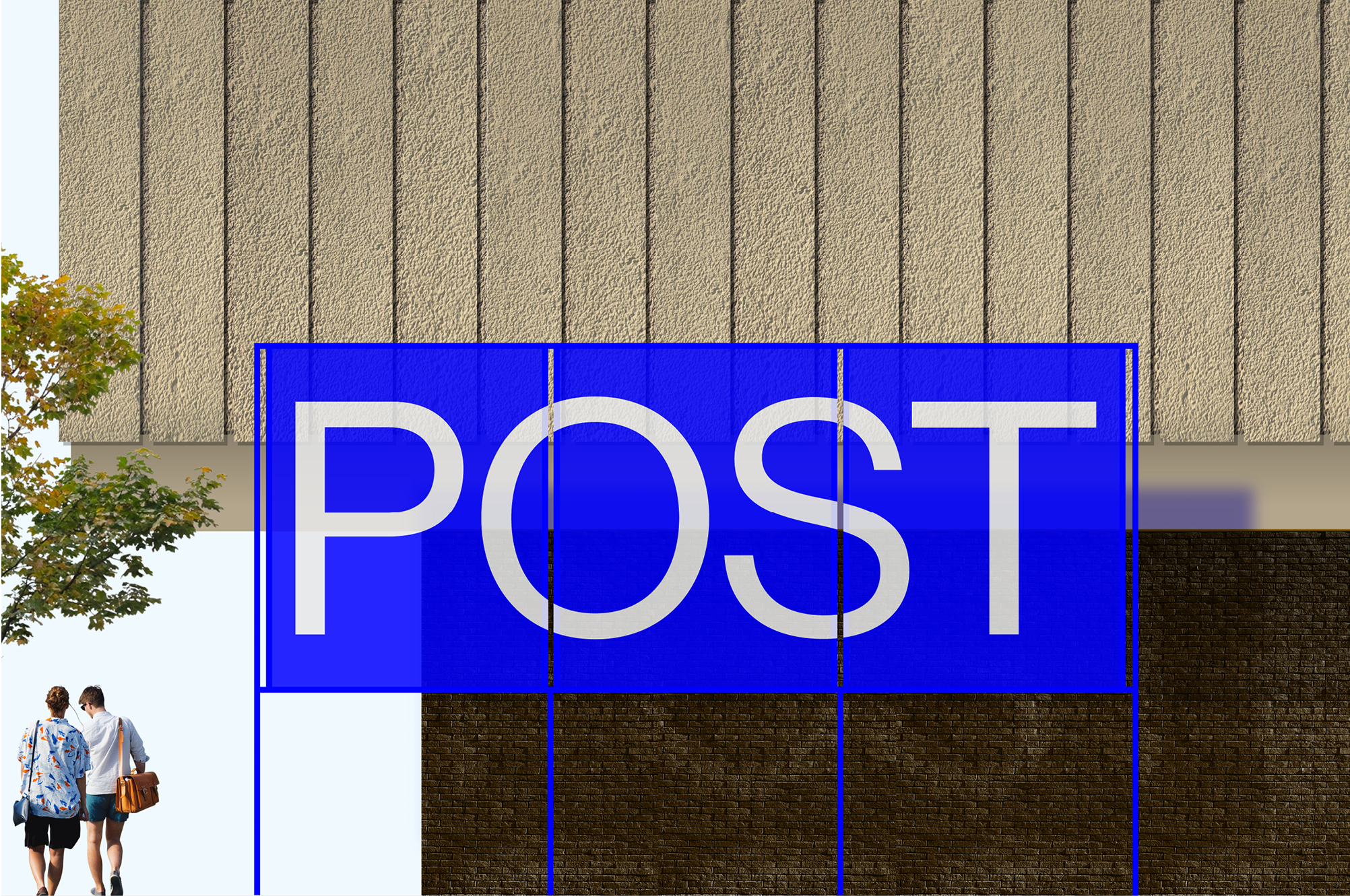
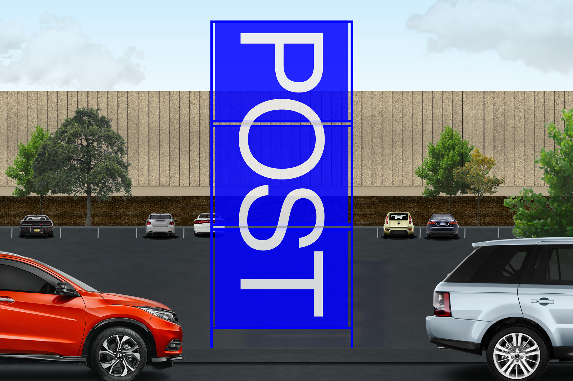
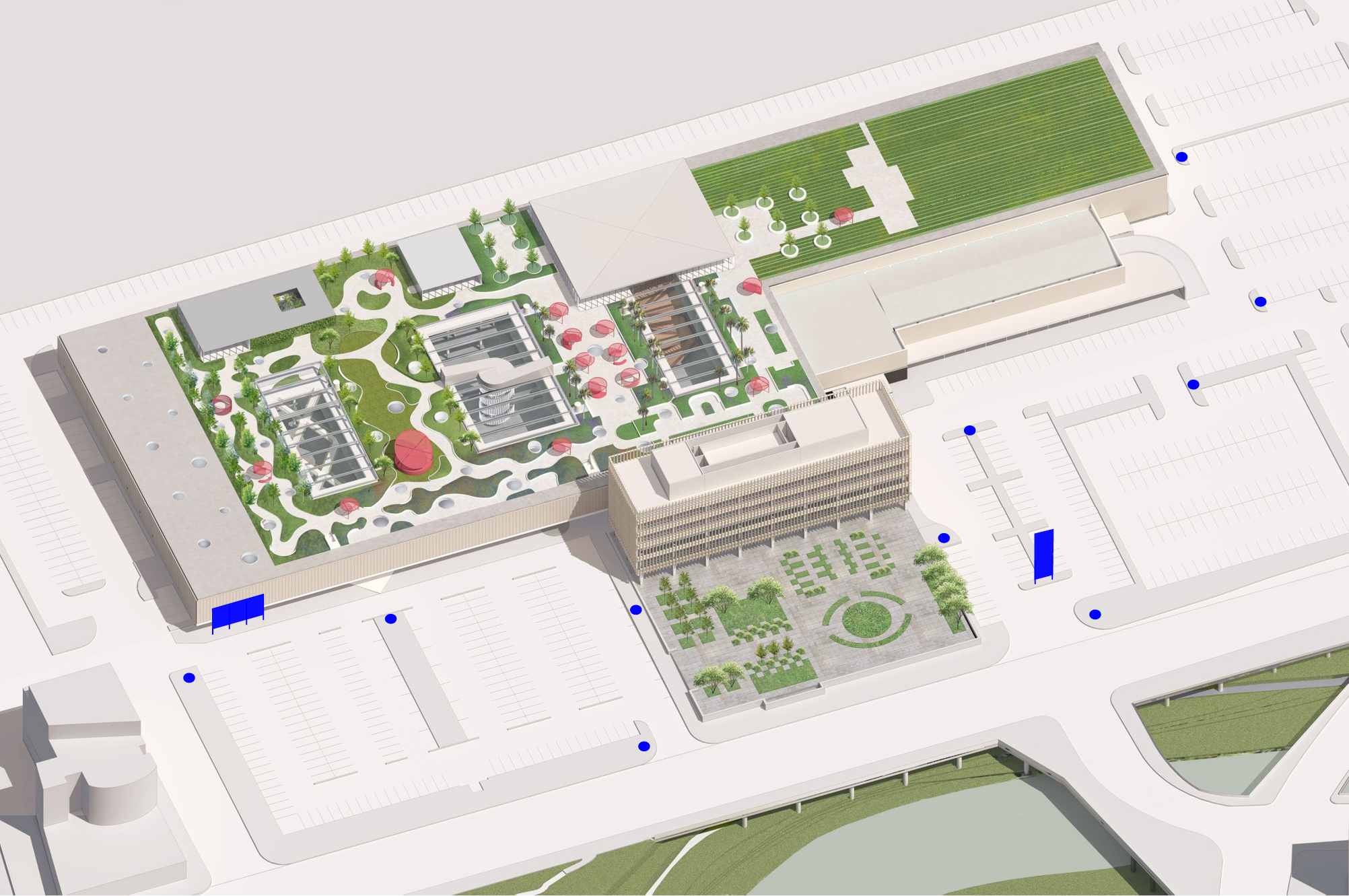
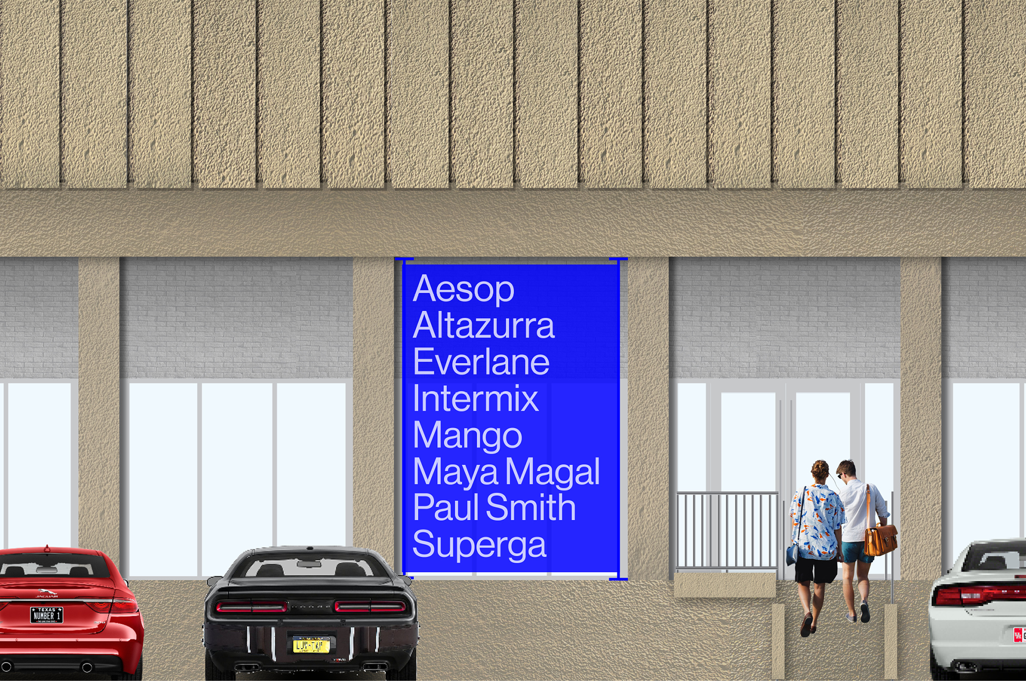
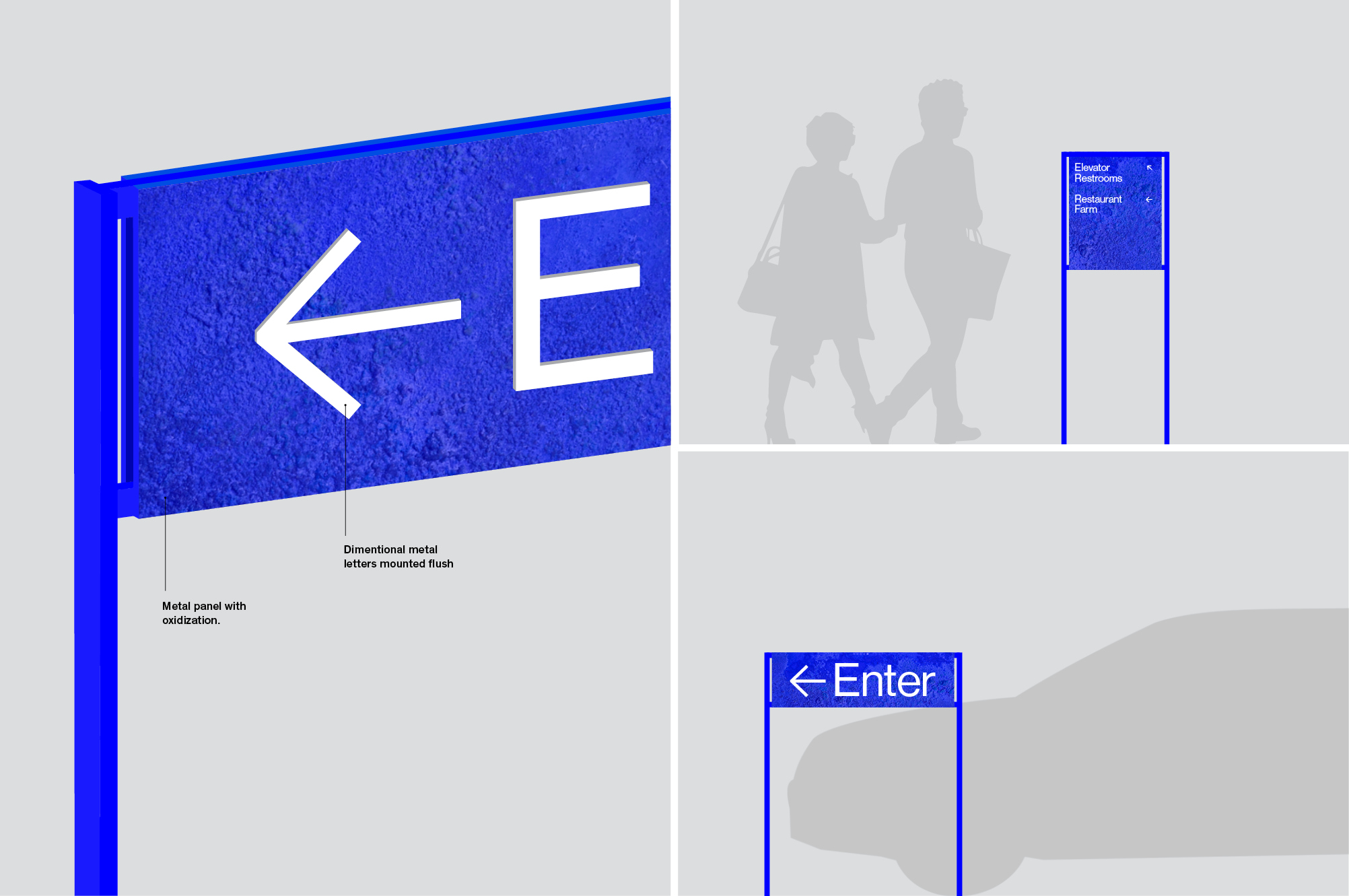
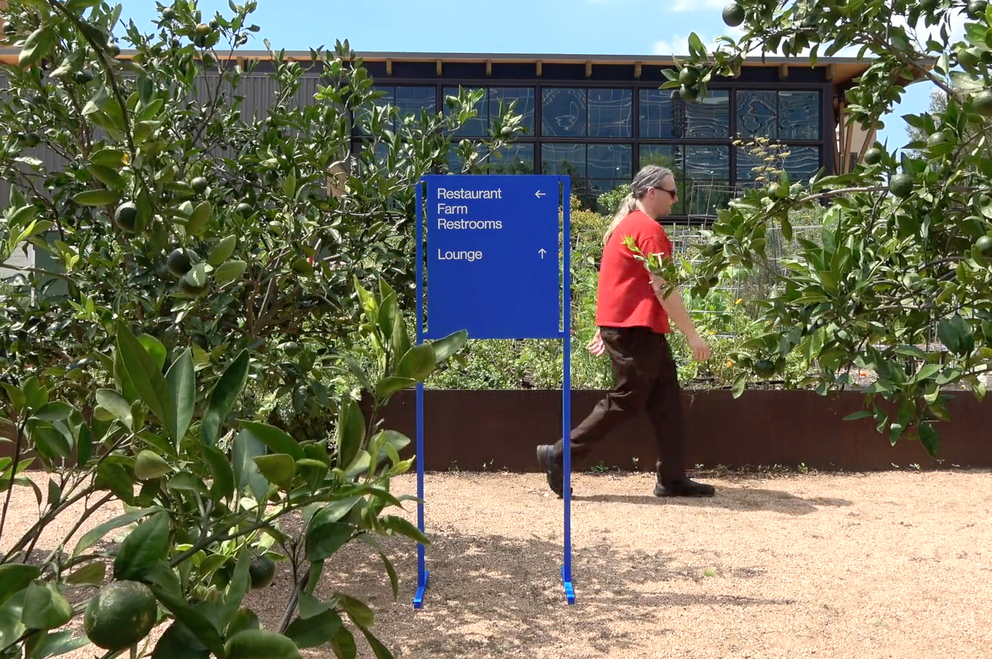
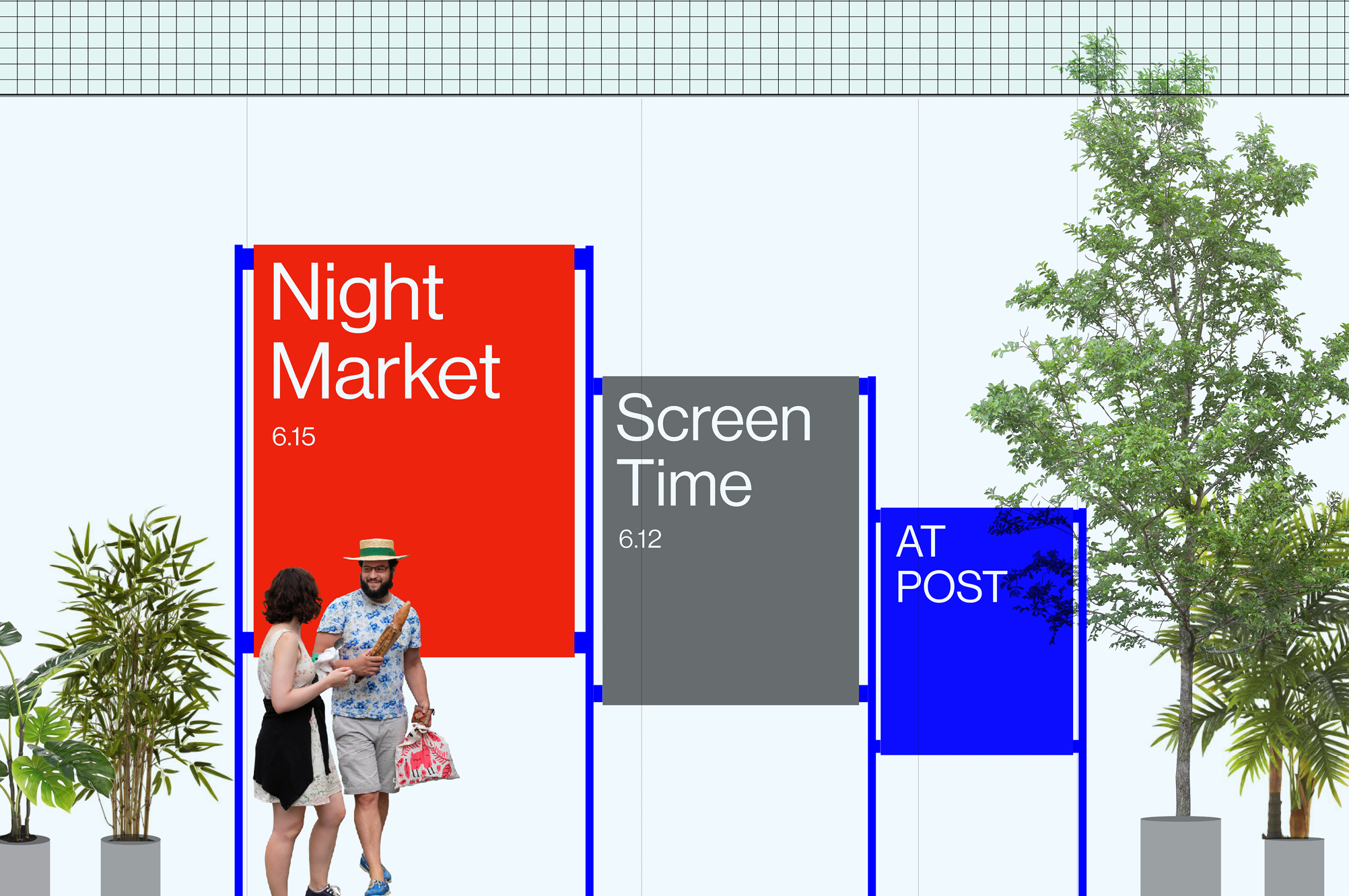
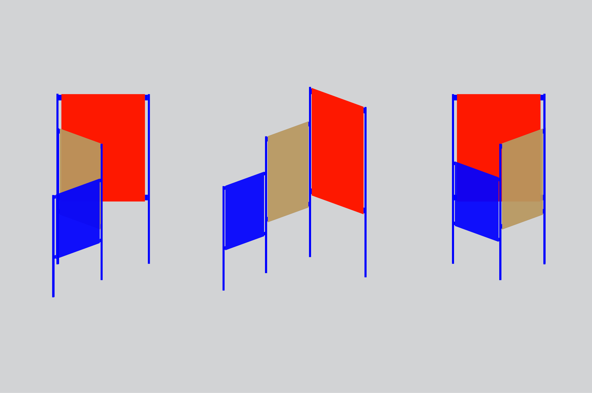
POST is a next-generation destination in a historically preserved site. Signage for the mixed-use development needs to visually announce bold ambitions while complying with strict restrictions. POST’s site signage system features two billboard-sized frames whose panels are swapped out to announce upcoming events. The signage system combines permanent and temporary sign types to create larger, bolder signs which are visually activated year-round. Bright blue metal frames unify the signage system while accommodating a range of panel materials that are differentiated by sign type. Identity signs use translucent blue plexi panels, allowing light to spread POST's signature color onto the building. Wayfinding signs use oxidized metal and programming signs use colorful translucent panels to highlight the ever-changing series of events at POST.
Client: Lovett Development
Architect: OMA with Powers Brown
Design development: Formation
Metal prototyping: Kin & Company