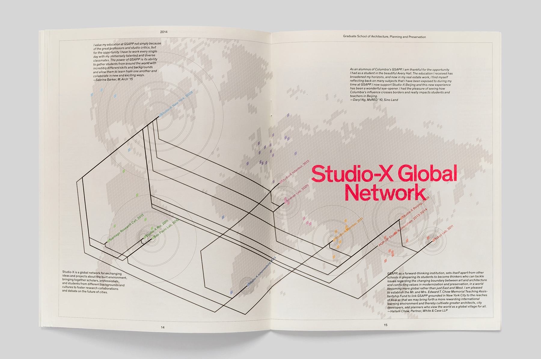
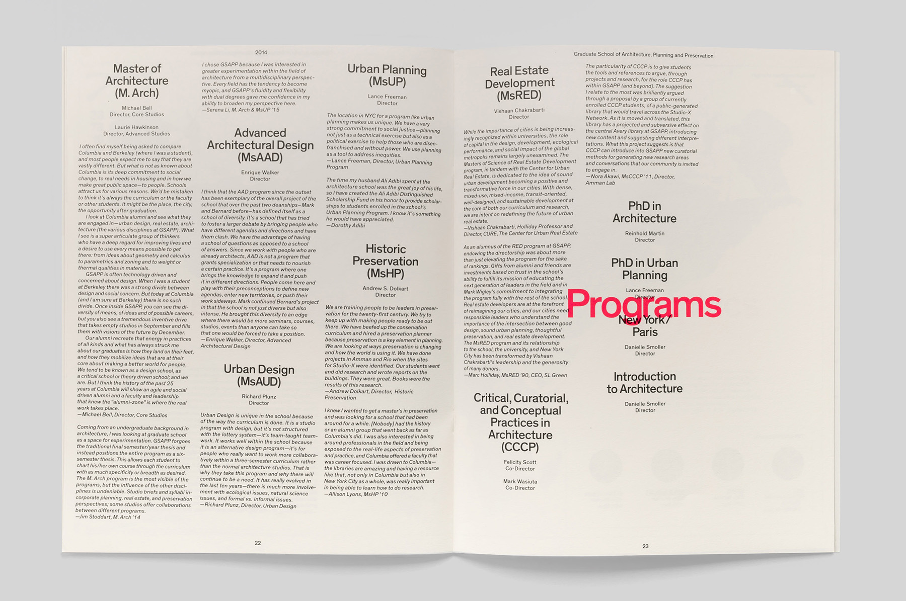
Dean's Report 
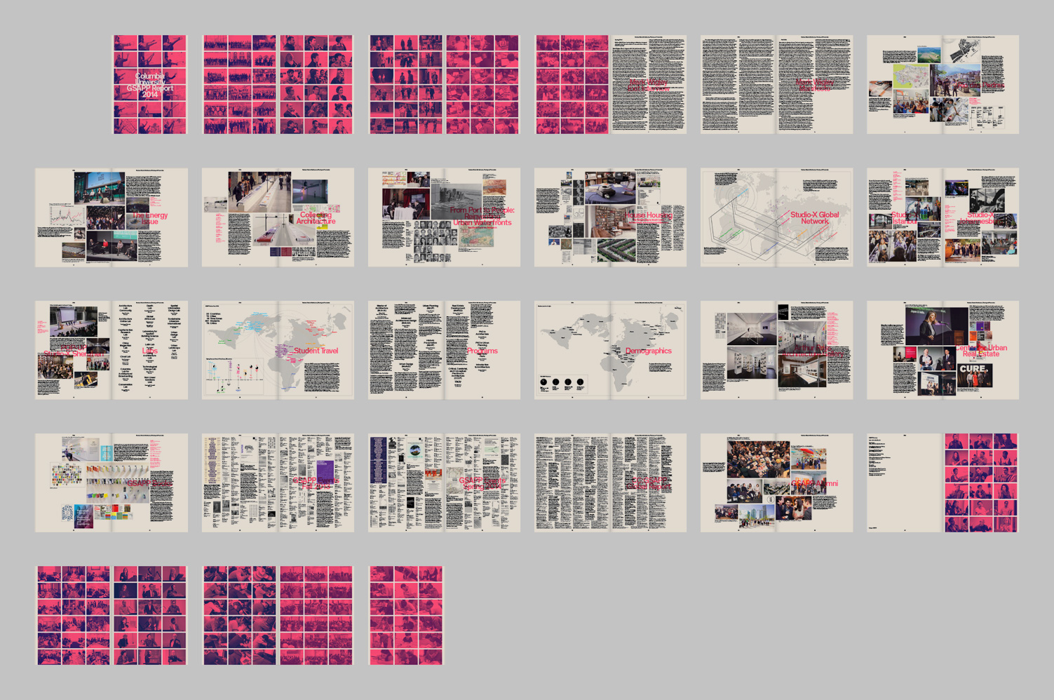
The GSAPP development office commissioned MTWTF to create a publication that would act as a snapshot of the school at the end of the tenth and final year of Mark Wigley’s deanship. The publication, used primarily as a development tool, visually explains the school’s many programs, labs, and initiatives to alumni and potential donors so as to secure financial support for current and future ventures. The report focuses on two features: (1) the infrastructure put in place since 2005, including labs, centers, and the Studio-X network, and (2) the flagship research projects and cross-disciplinary initiatives that use and build upon this infrastructure—for example, Rio das Pedras, a collaboration between GSAPP’s Architecture, Real Estate and Planning Departments, Columbia University’s Public Health and Engineering schools, the City of Rio de Janeiro and Studio-X Rio which endeavors to rethink the future of favelas.
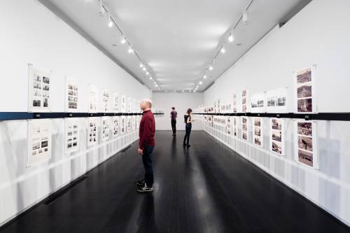
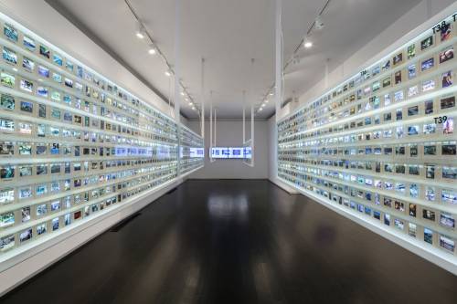
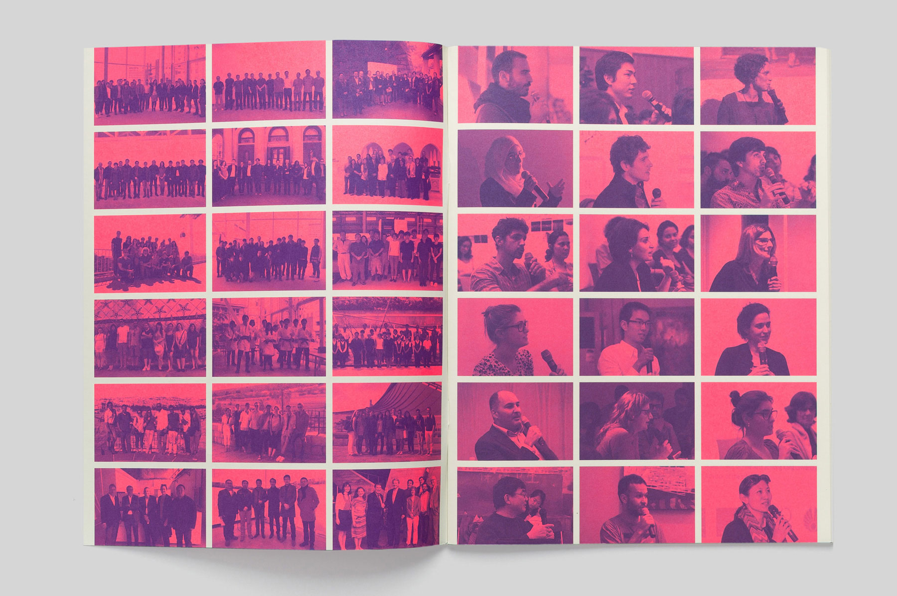
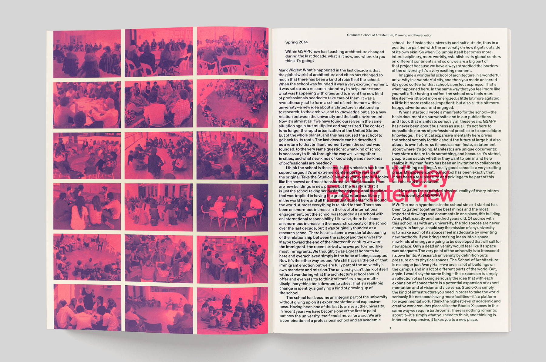
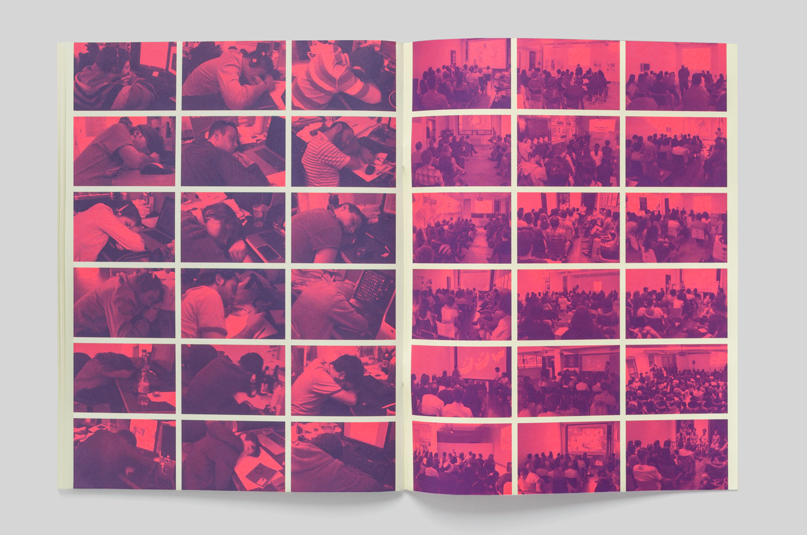
The report takes the form of two nested booklets: (1) an interior scrapbook which presents one initiative or infrastructural element per spread, and (2) an exterior visual poem about the culture of the school. The scrapbook presents its content as a collection of quotes, textual excerpts and captioned images specific to each spread. The visual poem is organized such that each page features photographs of students, faculty and guests engaged in the usual activities one does in schools, such as presenting, watching, sleeping, traveling or working.
The publication seeks to contrast two distinct yet complementary views of an educational institution: What people physically do together vs. the structures they cumulatively create.
Client: The Office of Development and Alumni Relations, GSAPP; Julia Fishkin, Director of Development

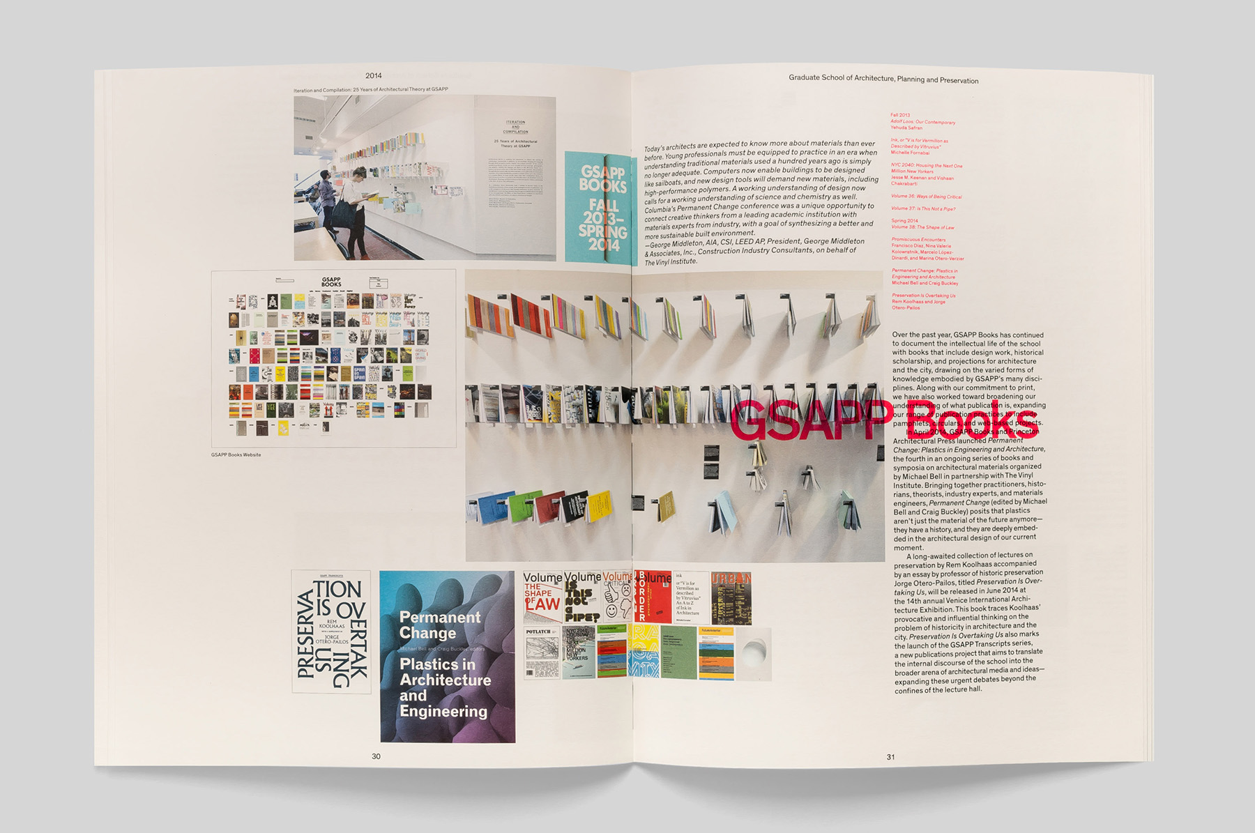
GSAPP Books
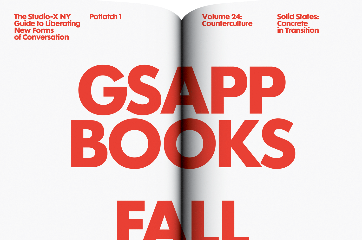
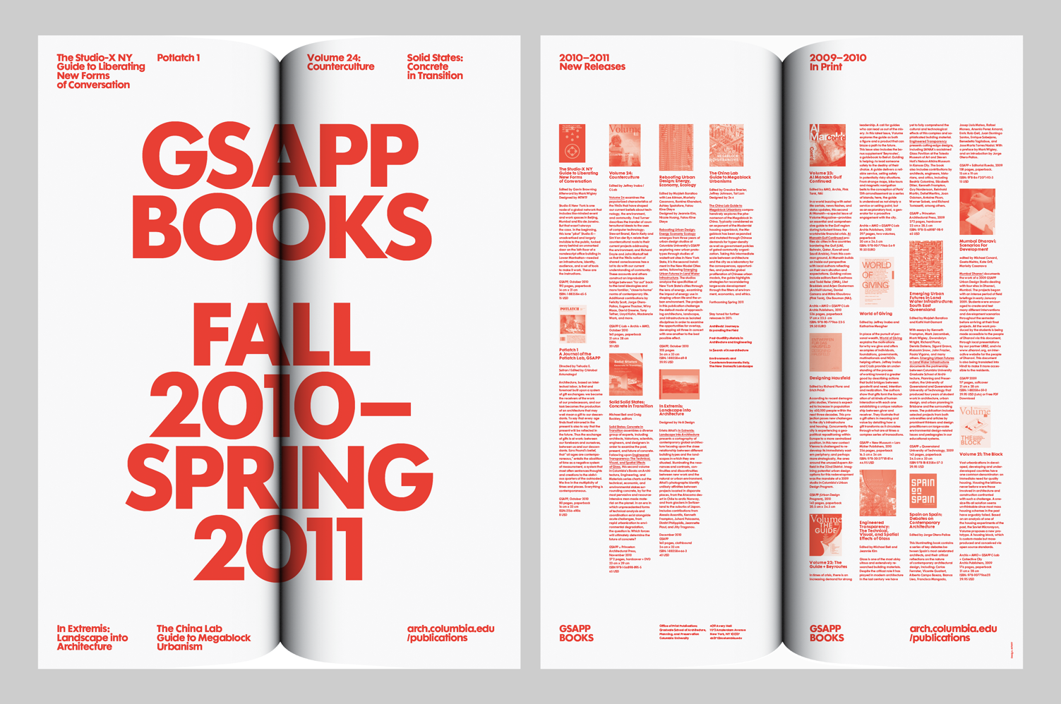
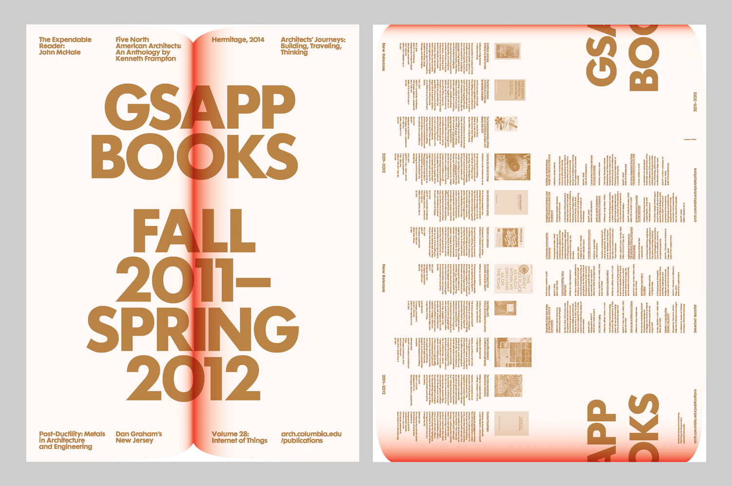
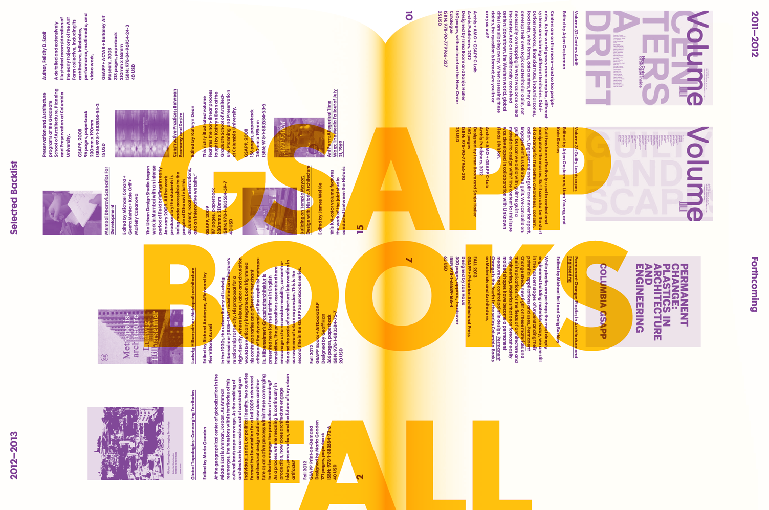
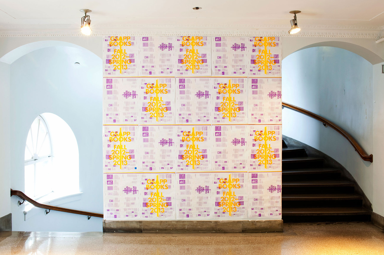
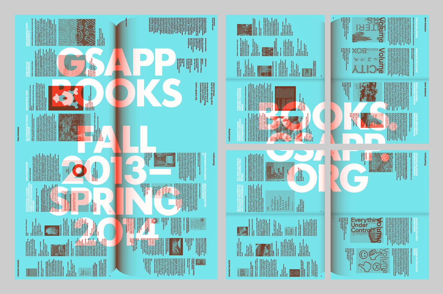
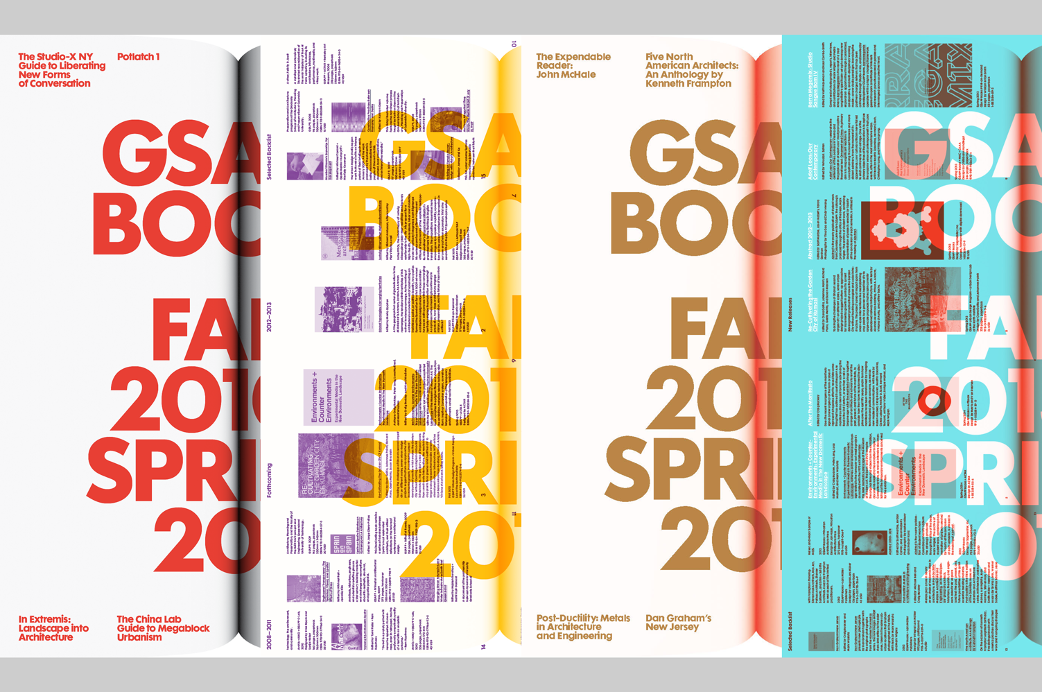
In 2010 the Director of Print Publications, Craig Buckley, commissioned MTWTF to design a vehicle to increase the visibility of GSAPP Books and its new or upcoming releases as well as selected titles from an extensive back catalog.
MTWTF imagined a mailer that would (1) function as a recognizable visual identity, building visual awareness and audience (2) arrive via post, or be seen online, acting as a catalog announcing its range of publications (3) be displayed at book launch events as a poster, or, tiled on the wall creating a supergraphic.
Each instance of the mailer draws its inspiration from dualities related to the physical form of the book and its production processes: verso vs. recto, sheet front and sheet back, folded signature vs. unfolded signature, pagination vs. flat sheet. The GSAPP Books mailer borrows the image of the book gutter and each time the mark appears it’s printed in two colors, swapping out colors each year. A consistent approach to the evolving project allowed for a progression of formats, each modified to accommodate the releases of the current year.
Client: GSAPP Books
Editor: Craig Buckley

The Durst Conferences
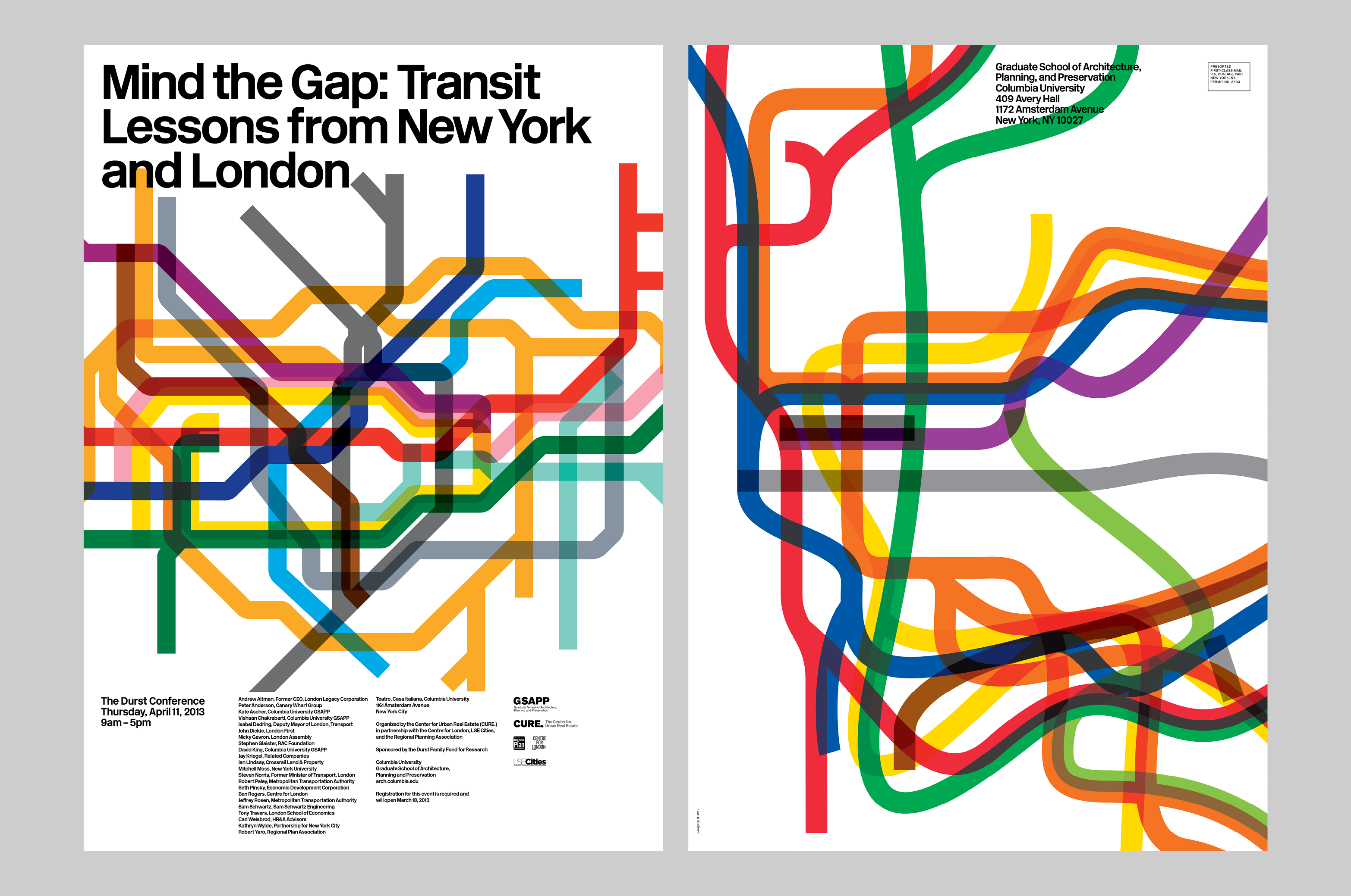
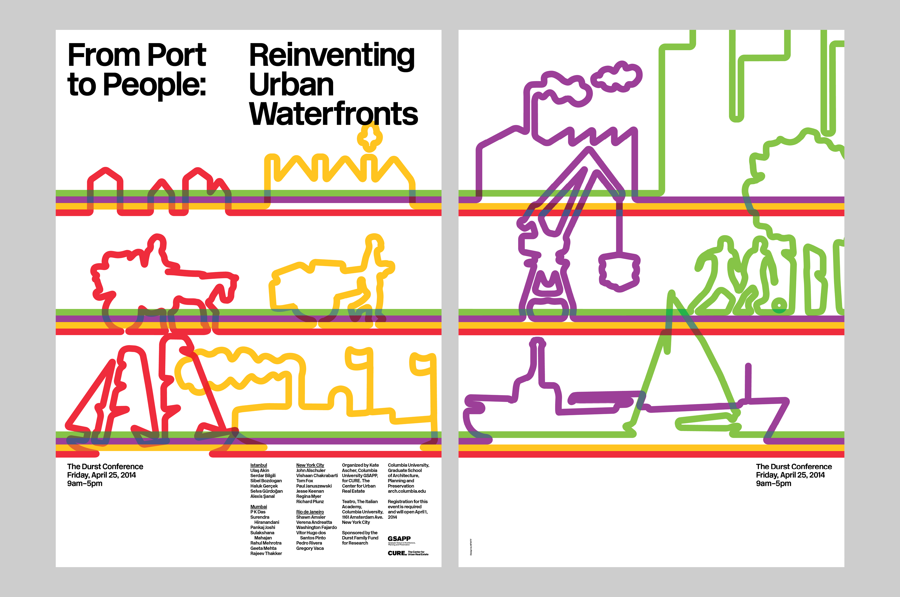
In 2013, the Durst Conference, organized by the Center for Urban Real Estate (CURE) and sponsored by the Durst Family Fund for Research, commissioned MTWTF to create a poster/invitation and program to increase the event’s visibility.
Each of the series uses thick, colorful lines to transform literal imagery into open, imaginative graphics. The “Mind The Gap: Transit Lesson from New York and London” poster features “fattened” transit maps from New York and London on the recto and verso. “From Port To People: Reinventing Urban Waterfronts” superimposes the subjects of the conference—four cities from four different eras—as a set of activated profiles forming a lyrical timeline.
MTWTF’s work aims to create a recognizable identity for the conference based on the the client’s preference for illustrative depiction by inventing a visual language in which to render pictures of things. The first instance playfully enlivens the familiar maps of subway lines, the second builds from the logic of the first to establish a “leapfrogging” visual system.
Client: The Center for Urban Real Estate (CURE) at GSAPP
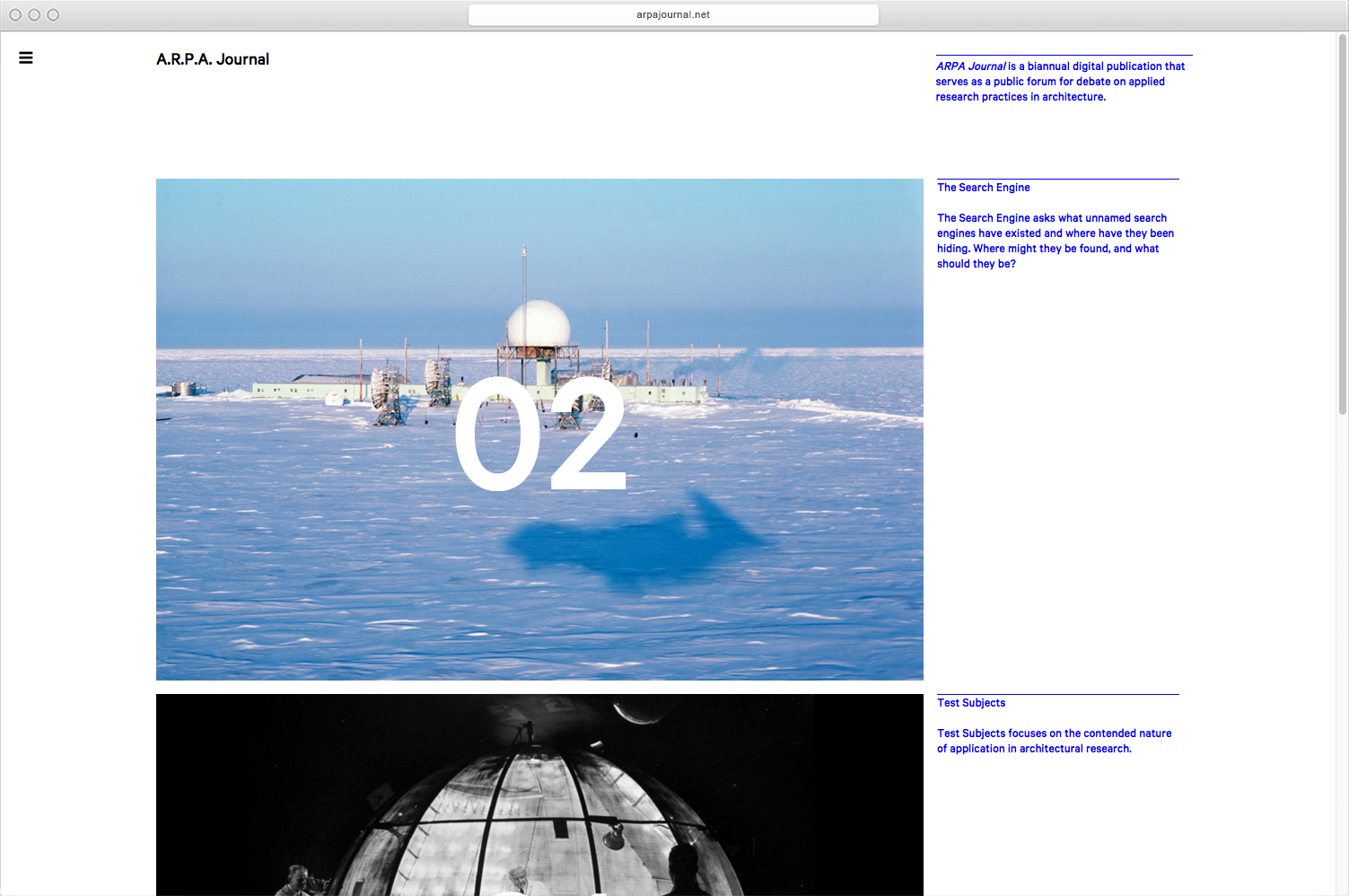
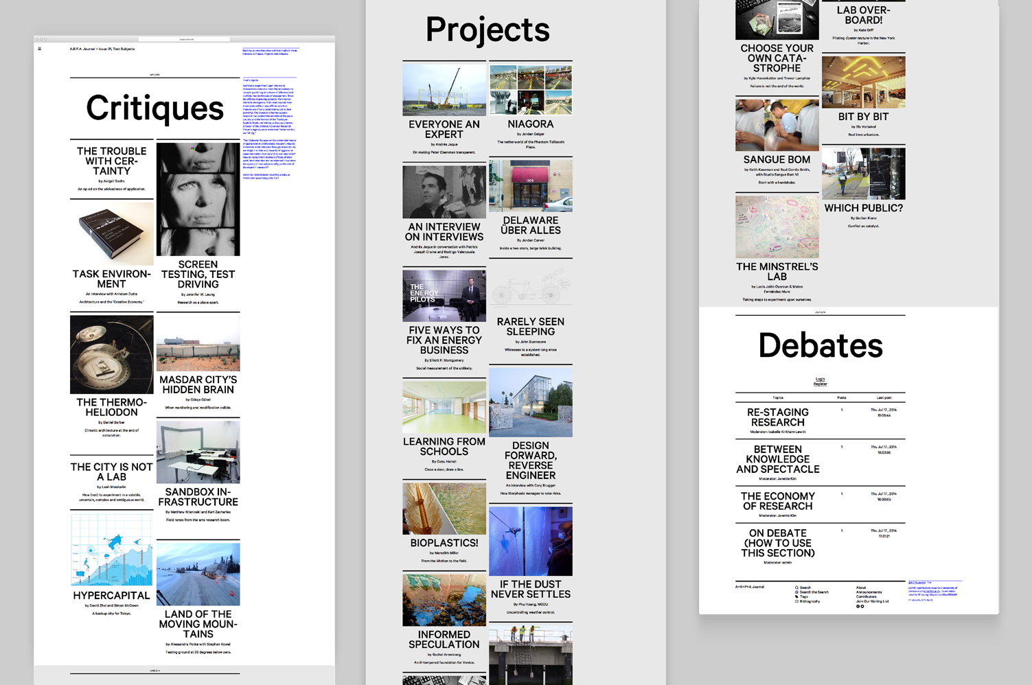
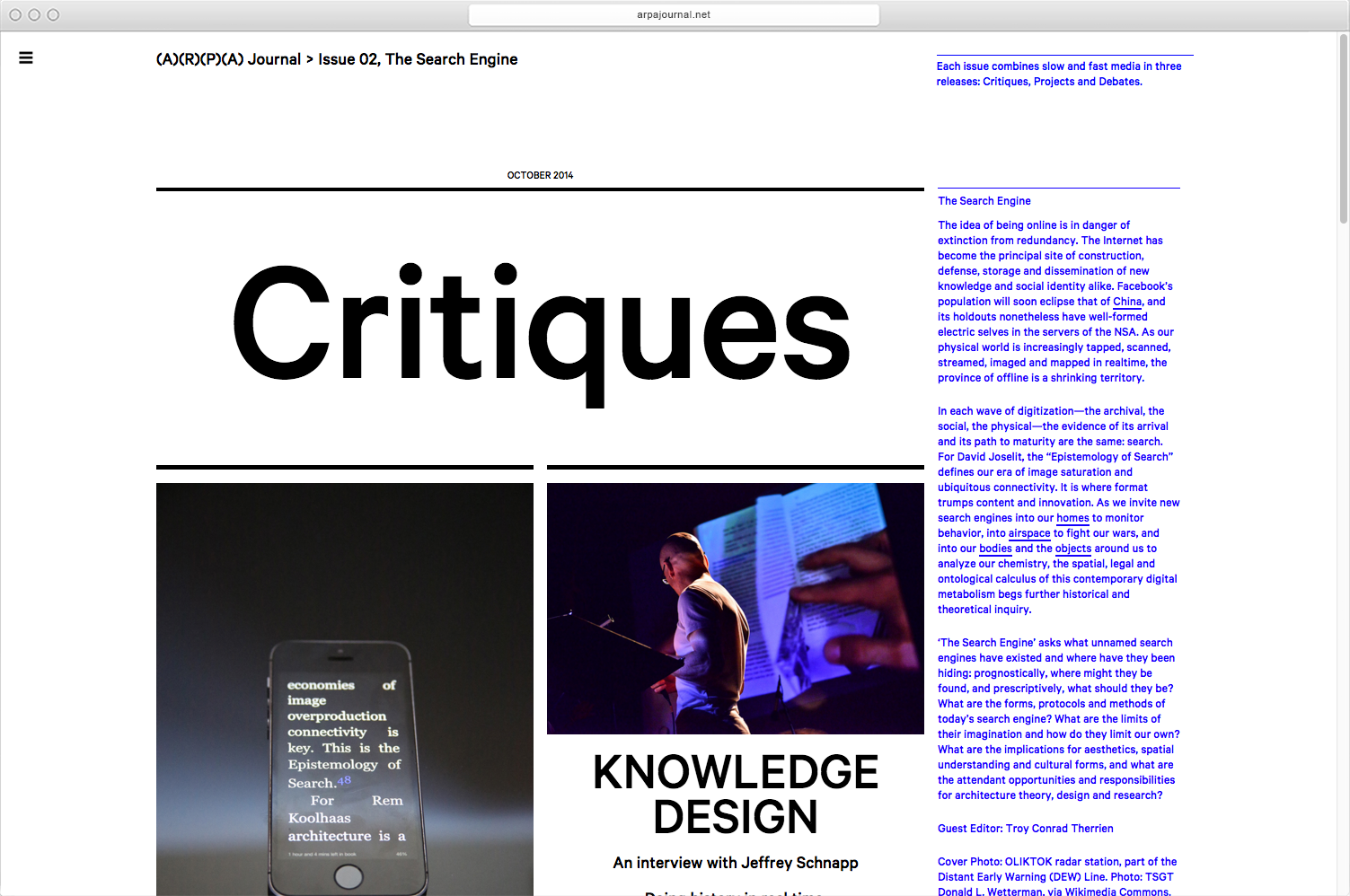
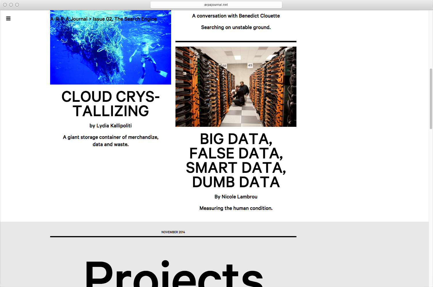
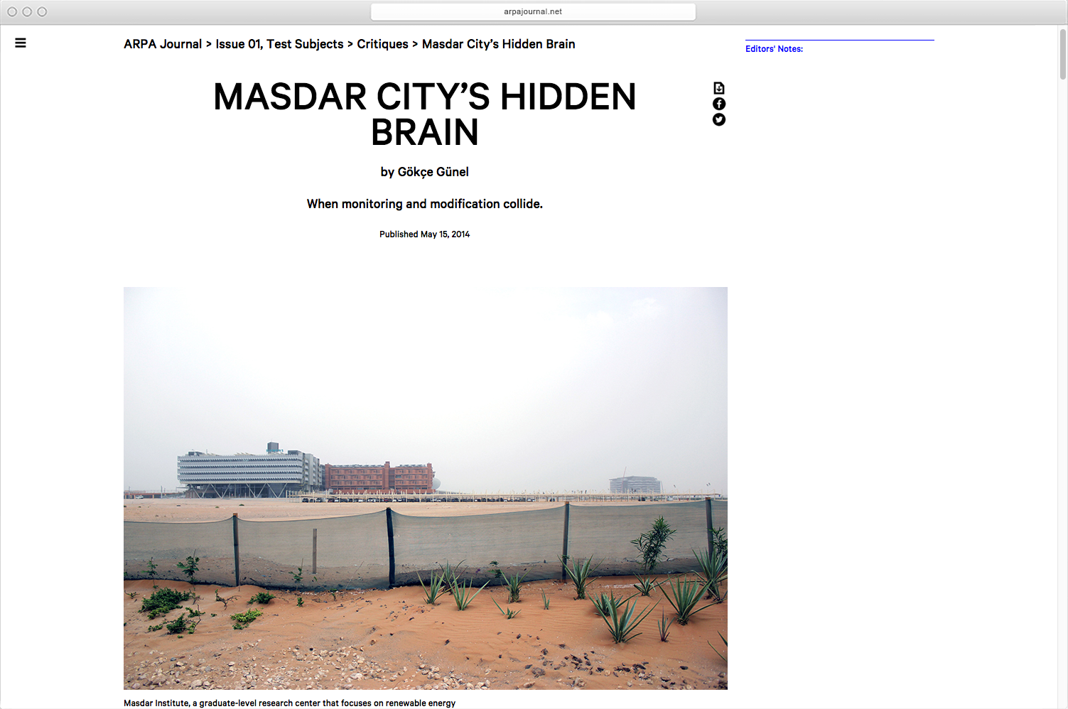
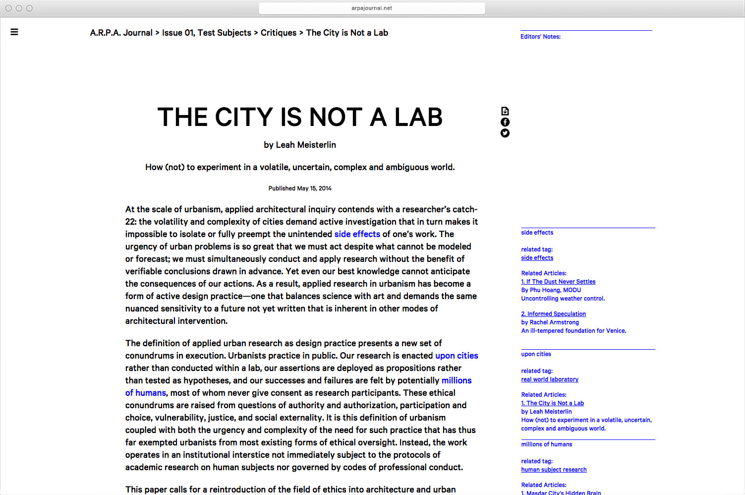
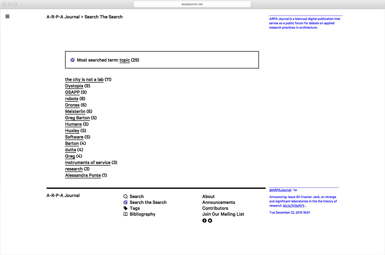
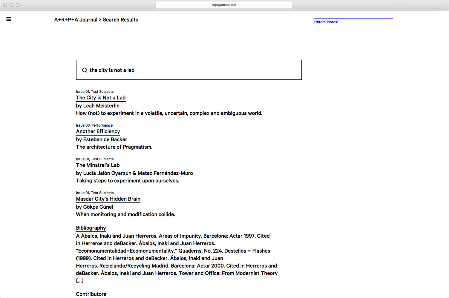
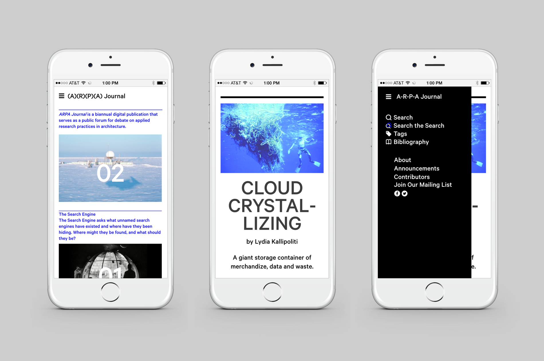
ARPA Journal
Client: Applied Research Practices in Architecture (ARPA) program, GSAPP
Editor: Janette Kim
Development: Connected Cat Media
Further reading: arpajournal.net
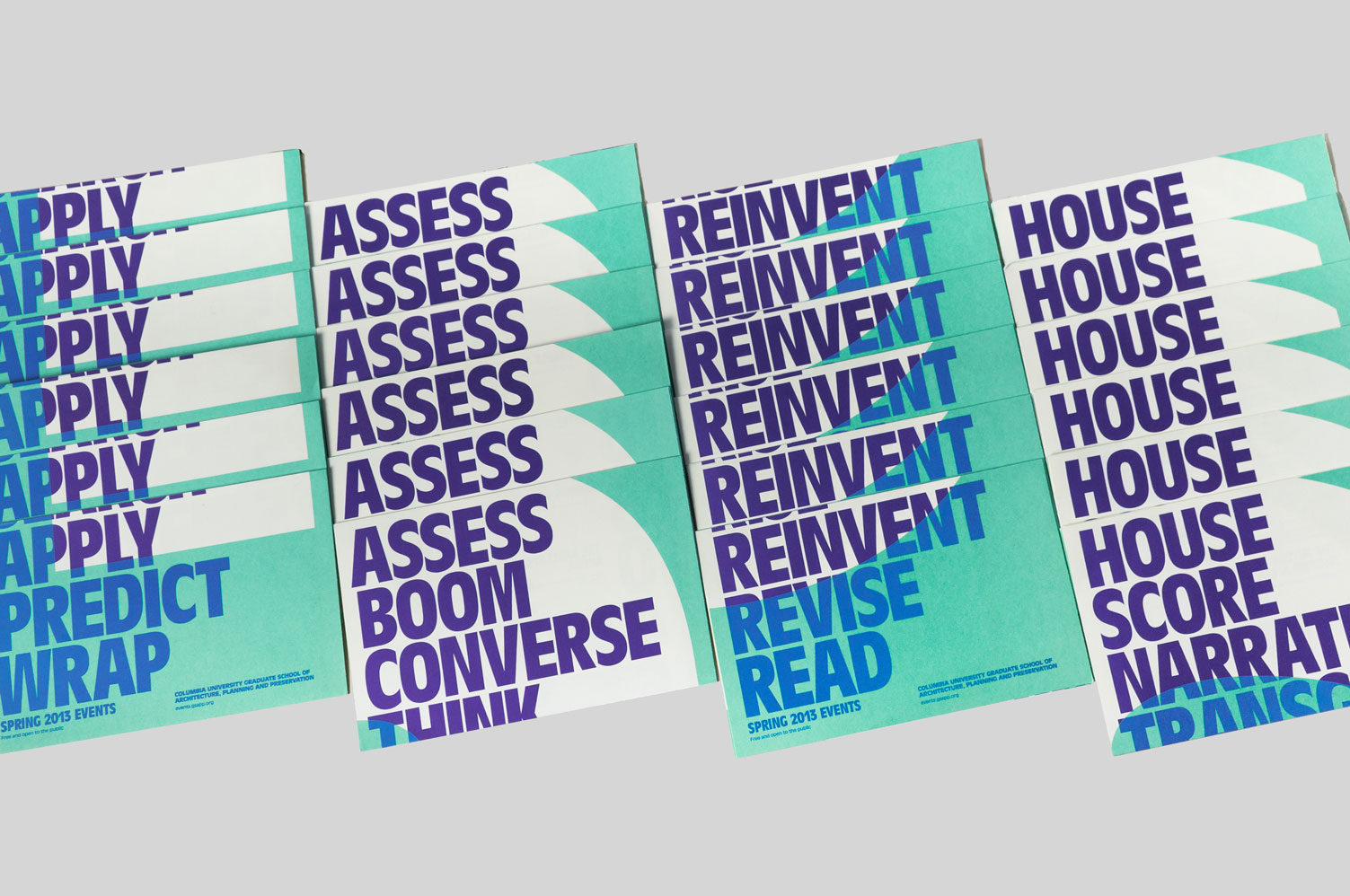
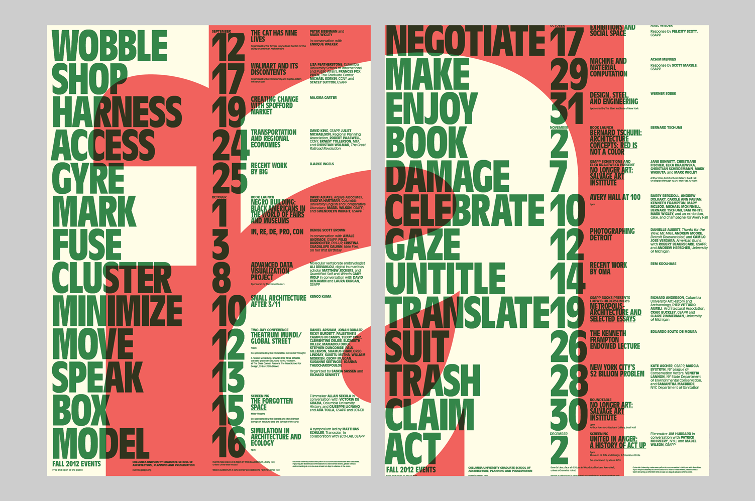
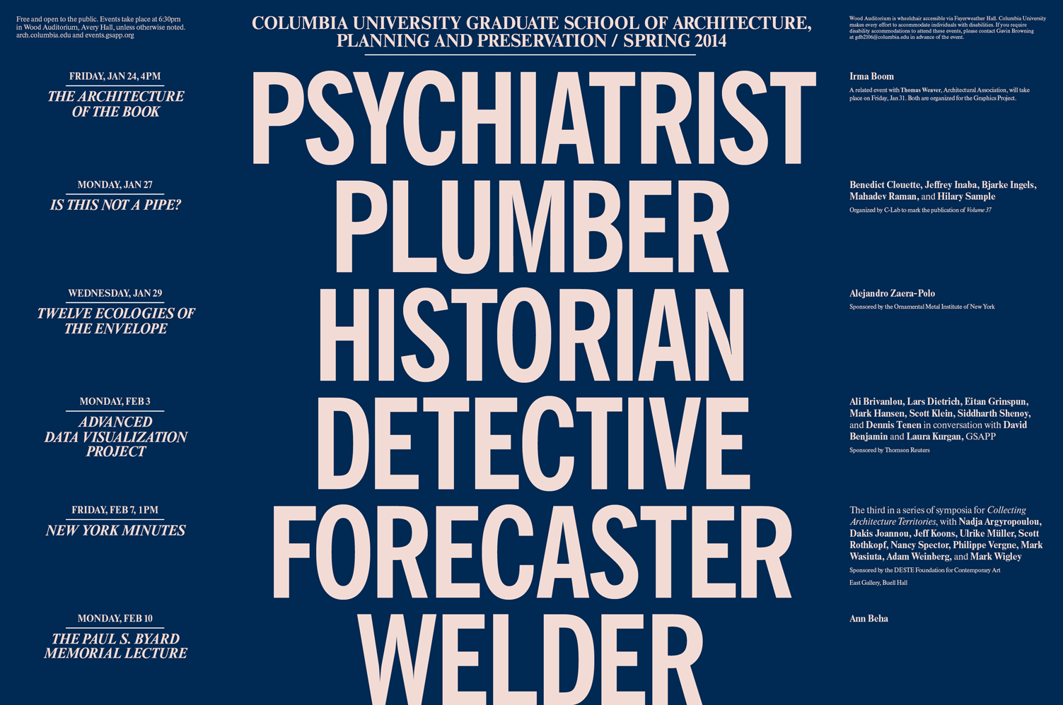
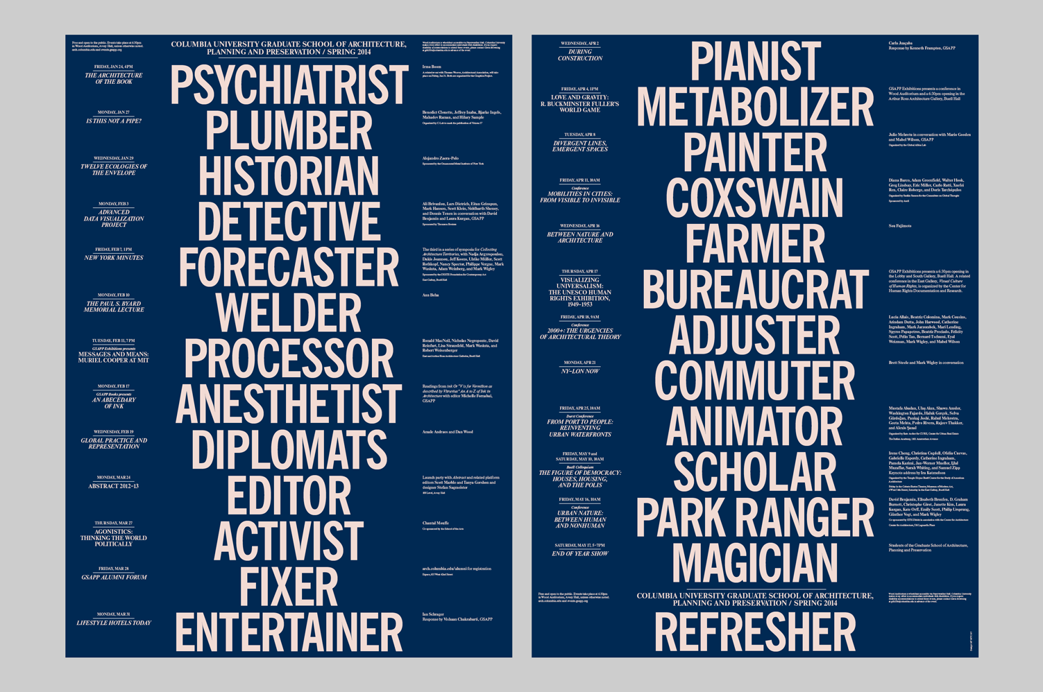
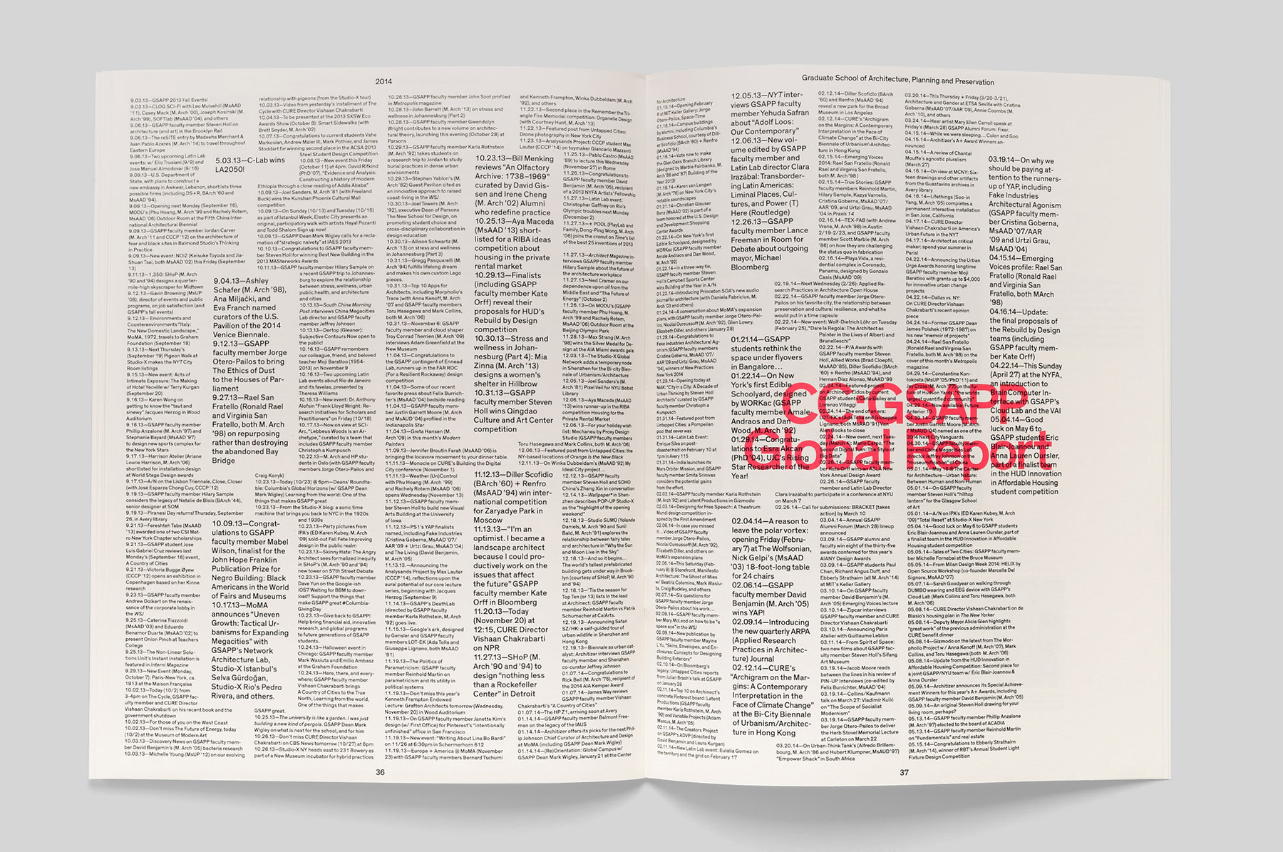
GSAPP events
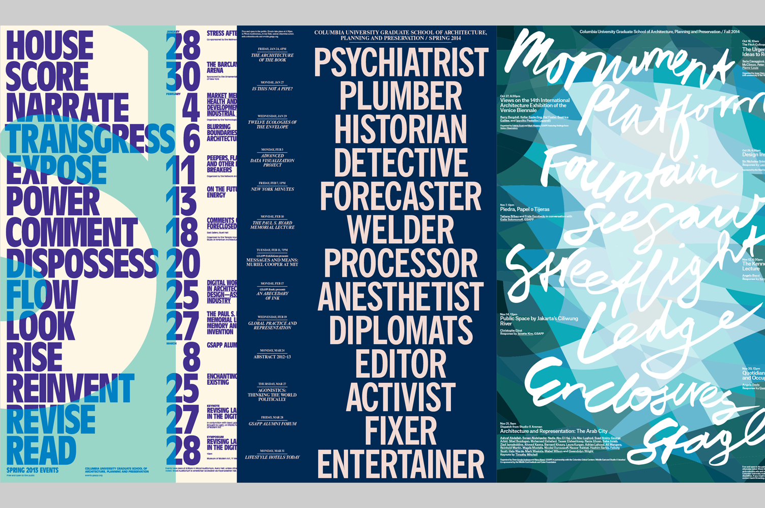
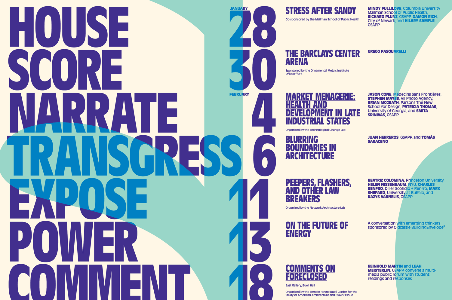
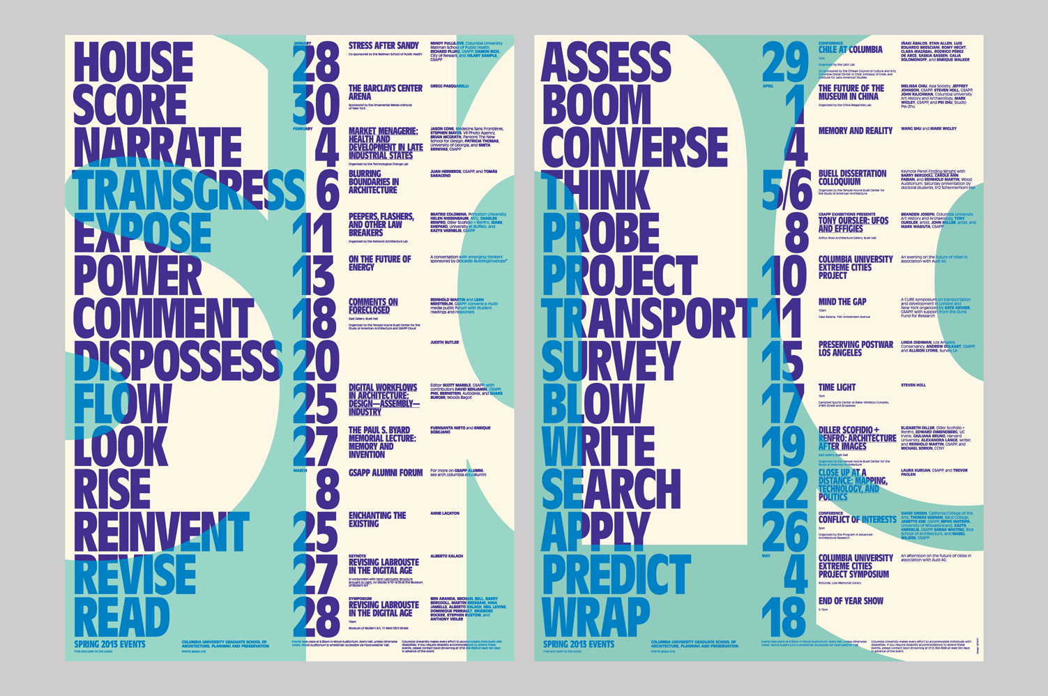
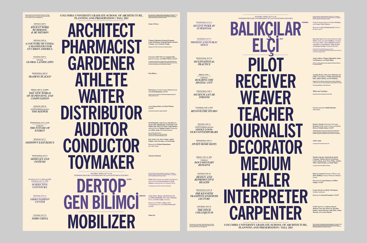
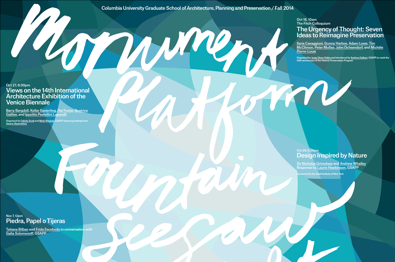
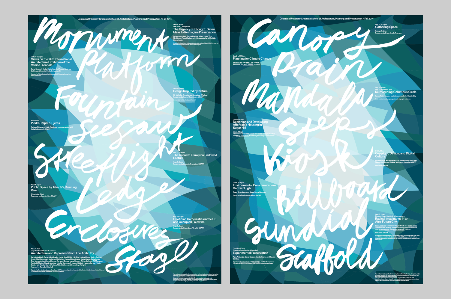
From 2012 through 2014, the Director of Events and Public Programing, Gavin Browning, commissioned MTWTF to create posters for the school’s Wood Hall lecture series. Browning constructed his own critical project around the event series and poster—which MTWTF enthusiastically supported and visually built upon—each year asking visiting lecturers to pick a single word connected to a text he had identified in advance. In 2013/14, inspired by Studs Terkel’s “Work”, participants selected a job title. In 2014/15, inspired by William H. Whyte’s “The Social Life of Small Urban Spaces”, participants selected a fixture found in public space. This list of words (e.g., “plumber”, “historian”, “detective”) acted as meta names for the events, creating a new critical space around the lectures and expanding the overall contextual framework. The project alters the dynamics of the lecture series through the production process of its announcement.
MTWTF’s design reformulates the familiar typology of “the list” within the format of an 18 x 24 inch poster through typographically-articulated rows arranged so that each row conveys one expanded event description. The 2012/13 poster organizes information from left and large, to right and small; the 2013/14 poster divides title and detail bi-laterally; and the 2014/15 poster groups title and details, alternating left and right, to give the information ample vertical space to orient to its word.
By foregrounding and facilitating Browning’s curatorial project and vision, collaborators became co-conspirators to depart from the conventional lecture series poster.
Client: Department of Events and Public Programs, GSAPP; Gavin Browning, Director
Further Reading: GSAPP 2013-14
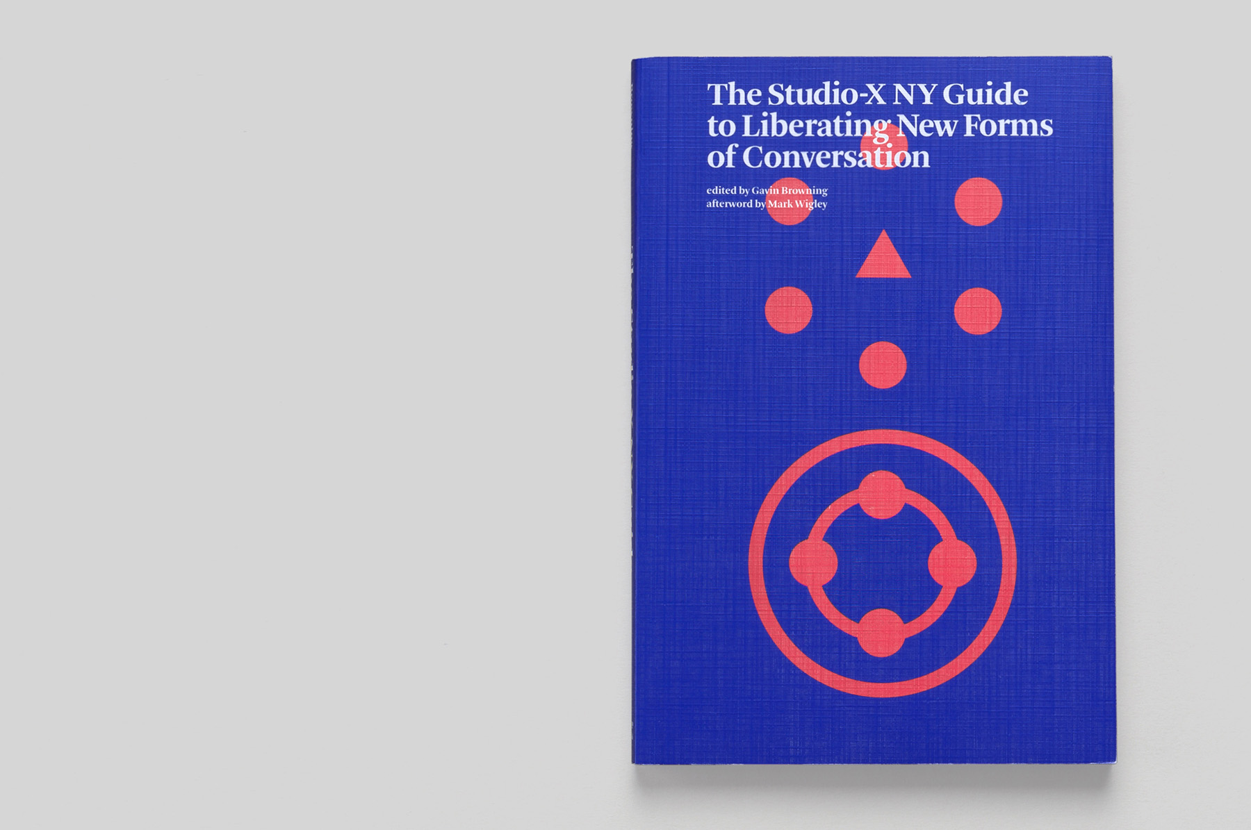
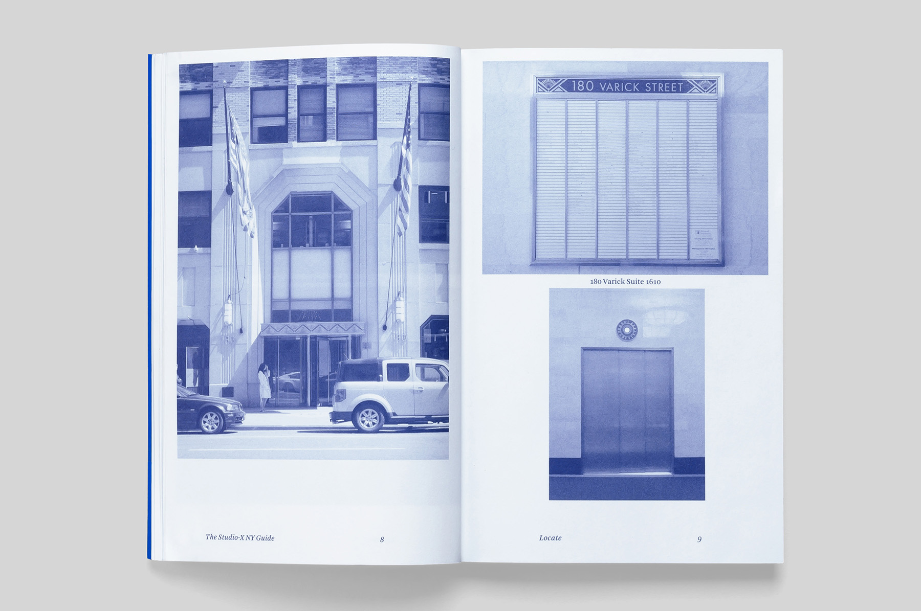
The Studio-X NY Guide to Liberating New Forms of Conversation
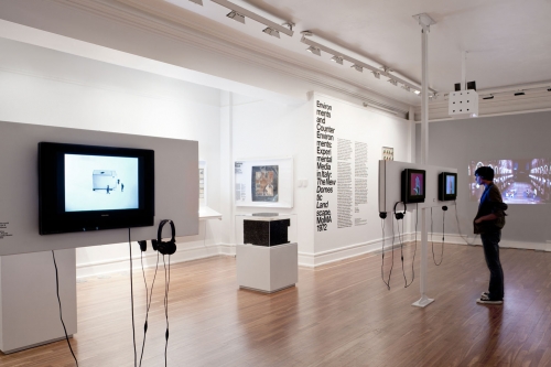
From 2007 to 2009 Studio-X NY, a downtown outpost of GSAPP and prototype for a collaborative global network, functioned as work space for the school’s independent research labs during the day. In the evening, Studio-X was programmed as an experimental cultural space offering talks, events, group activities and exhibitions.
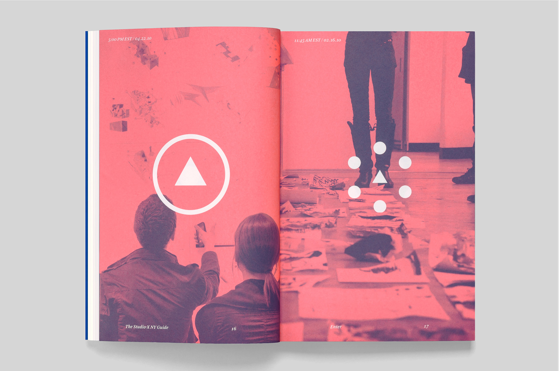
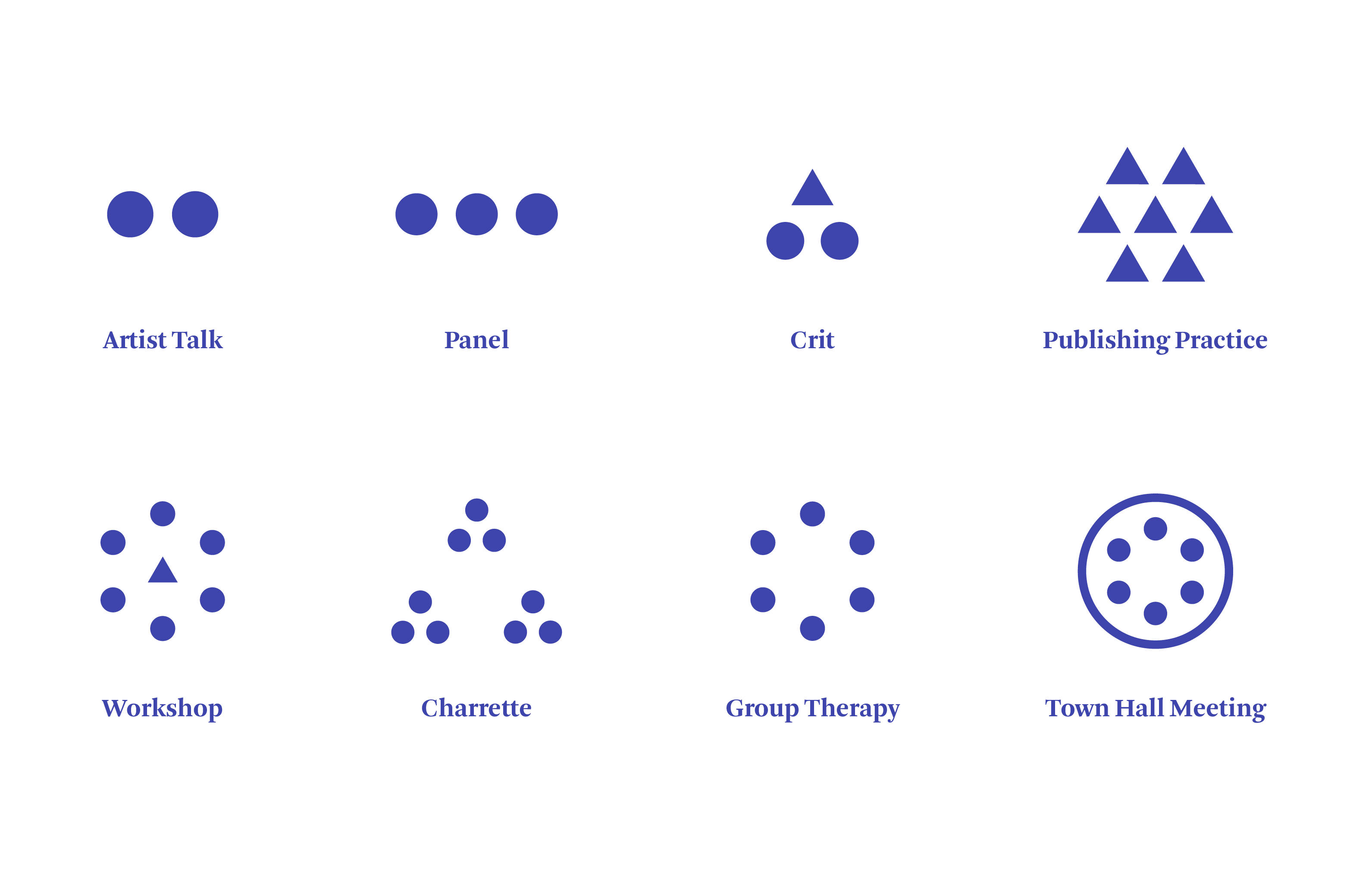
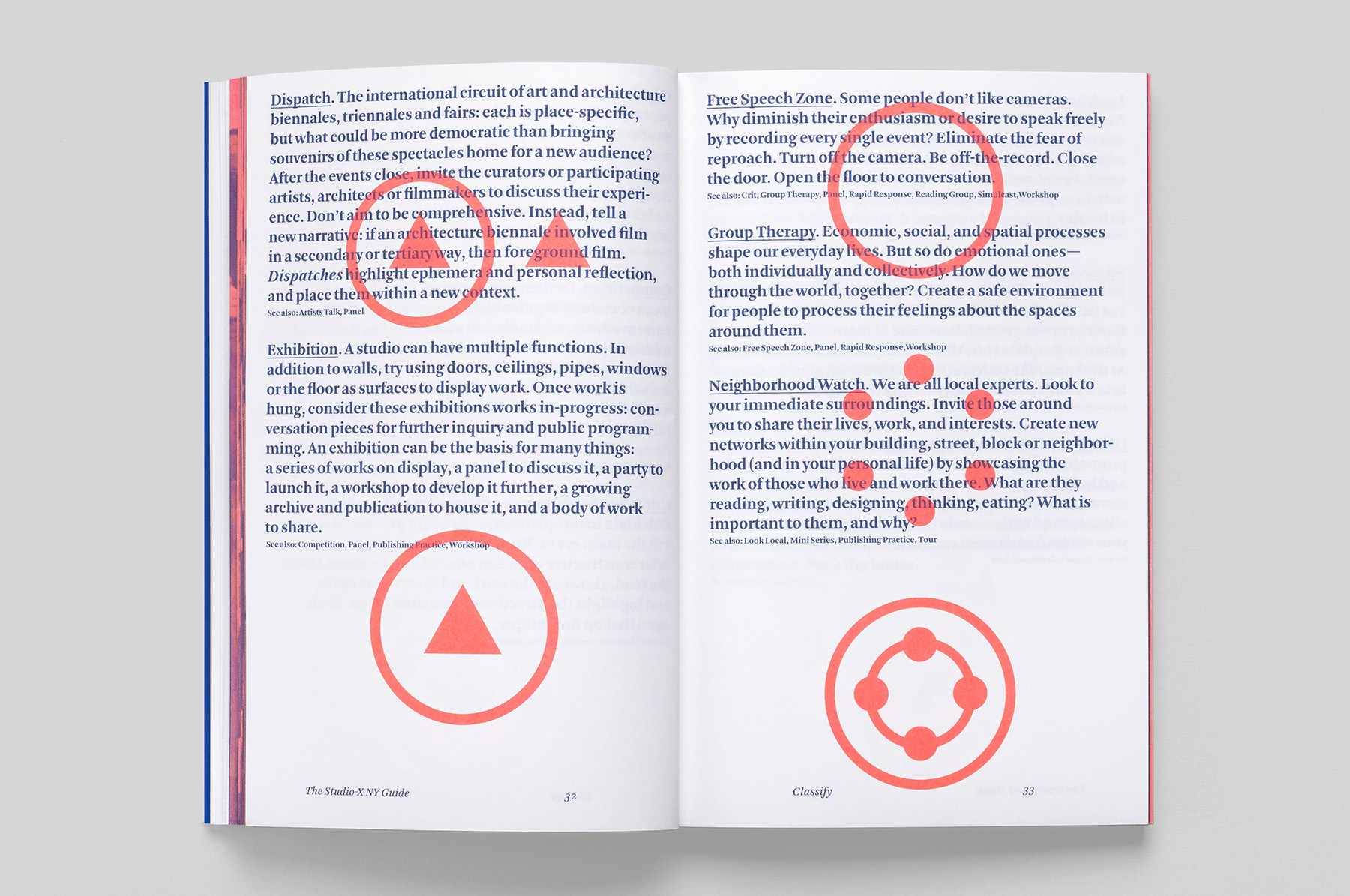
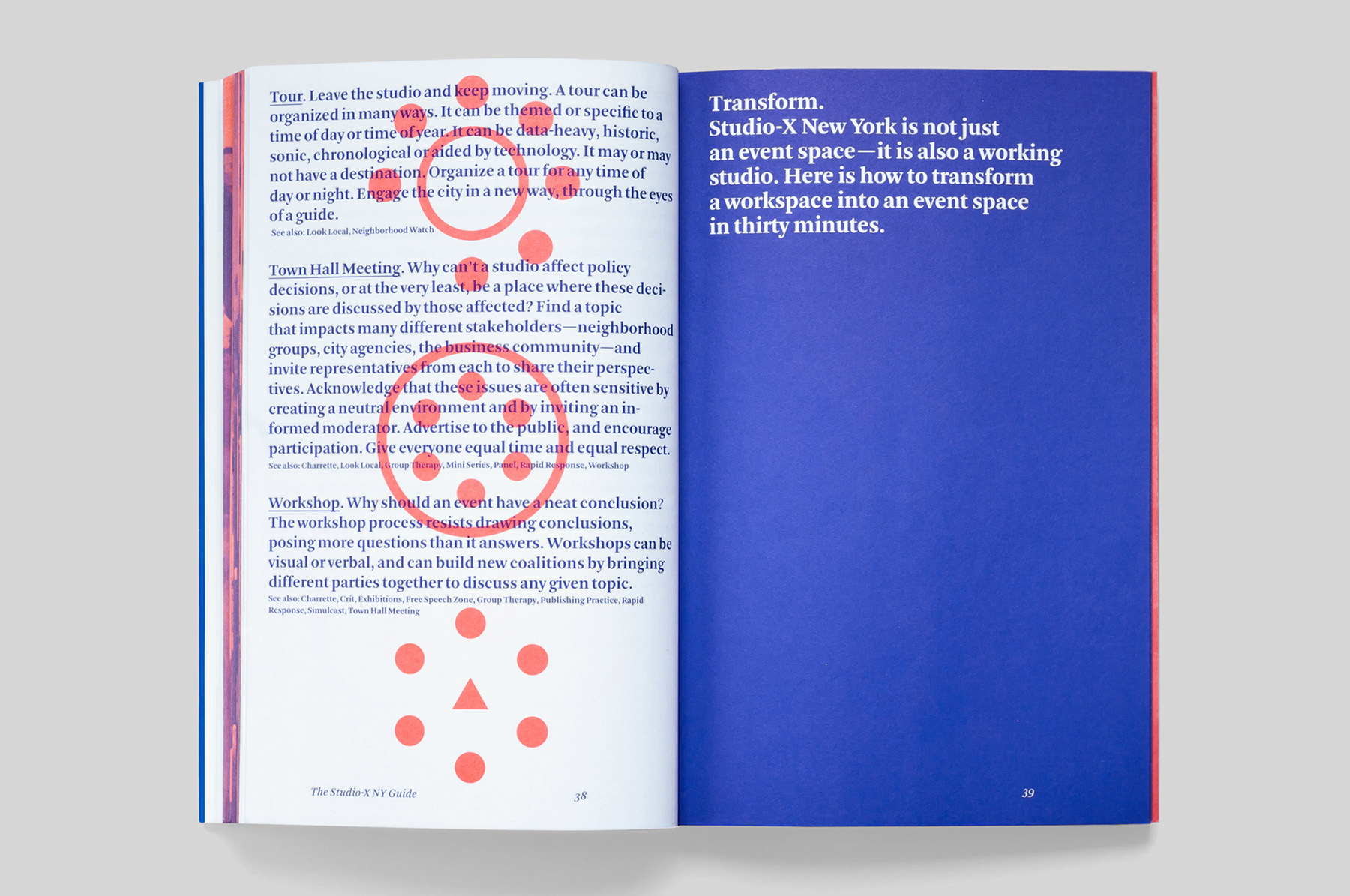
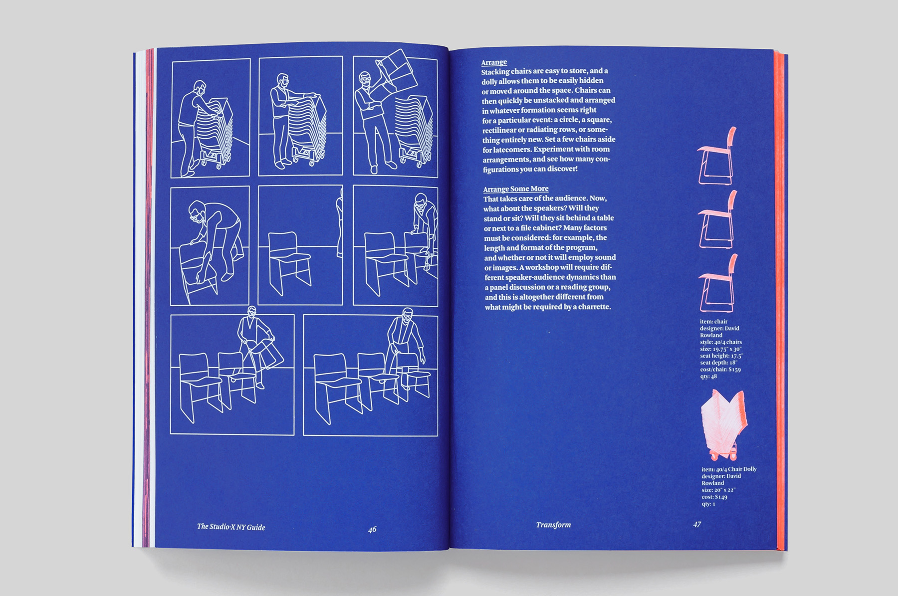
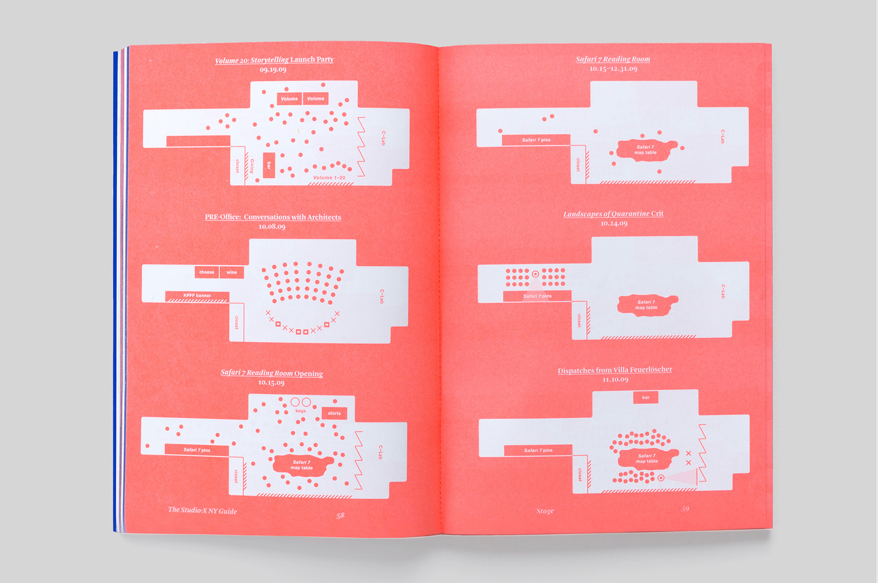
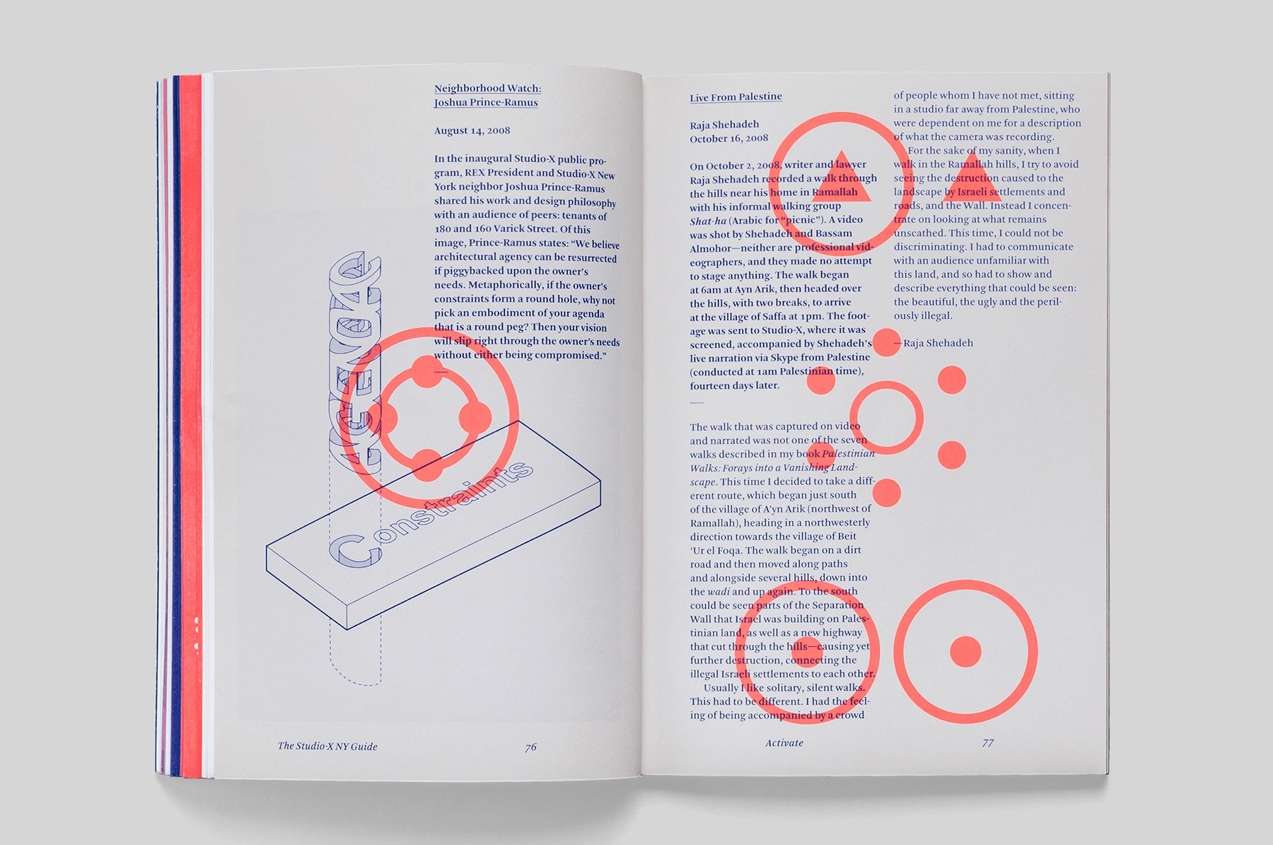
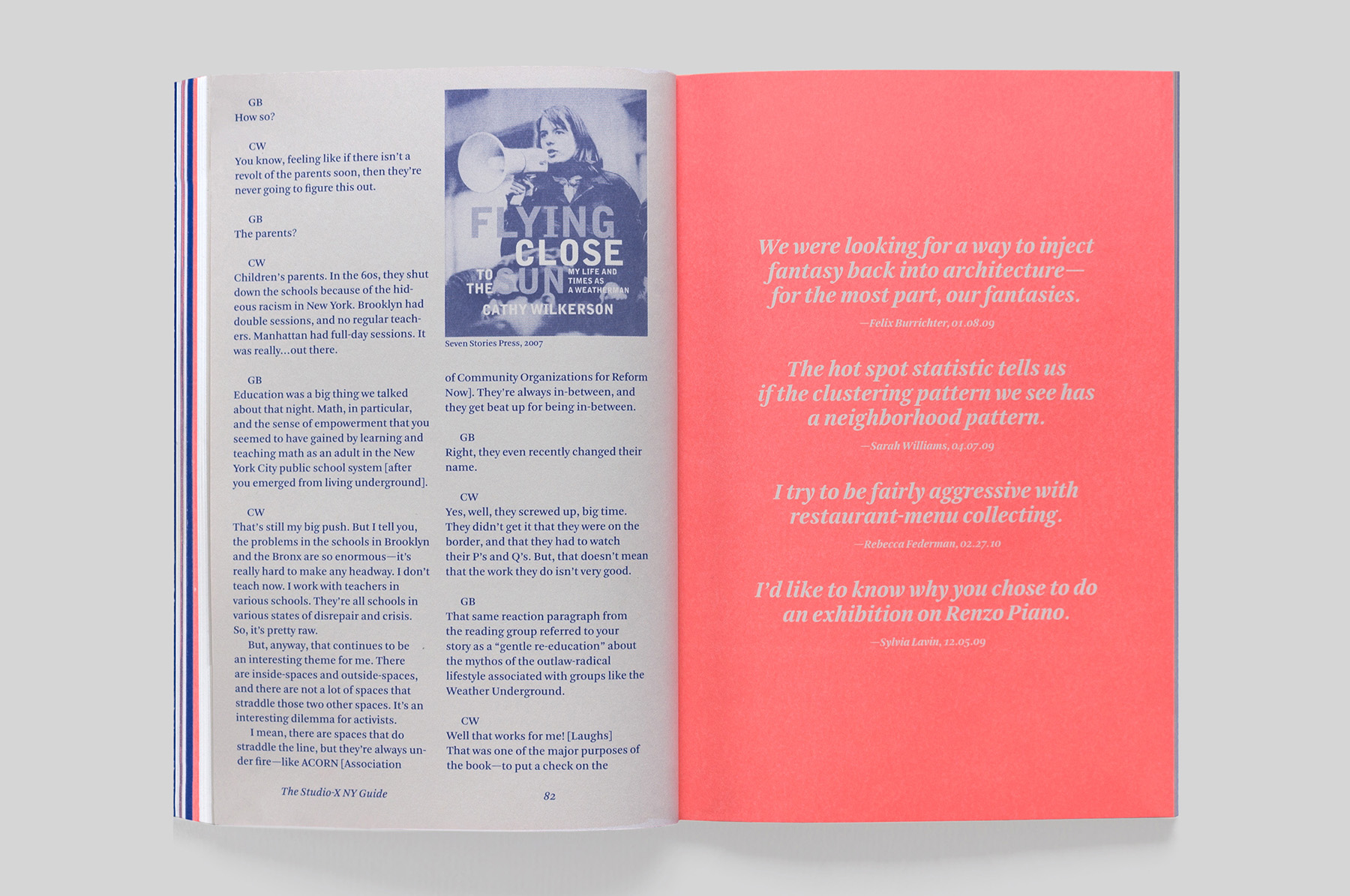
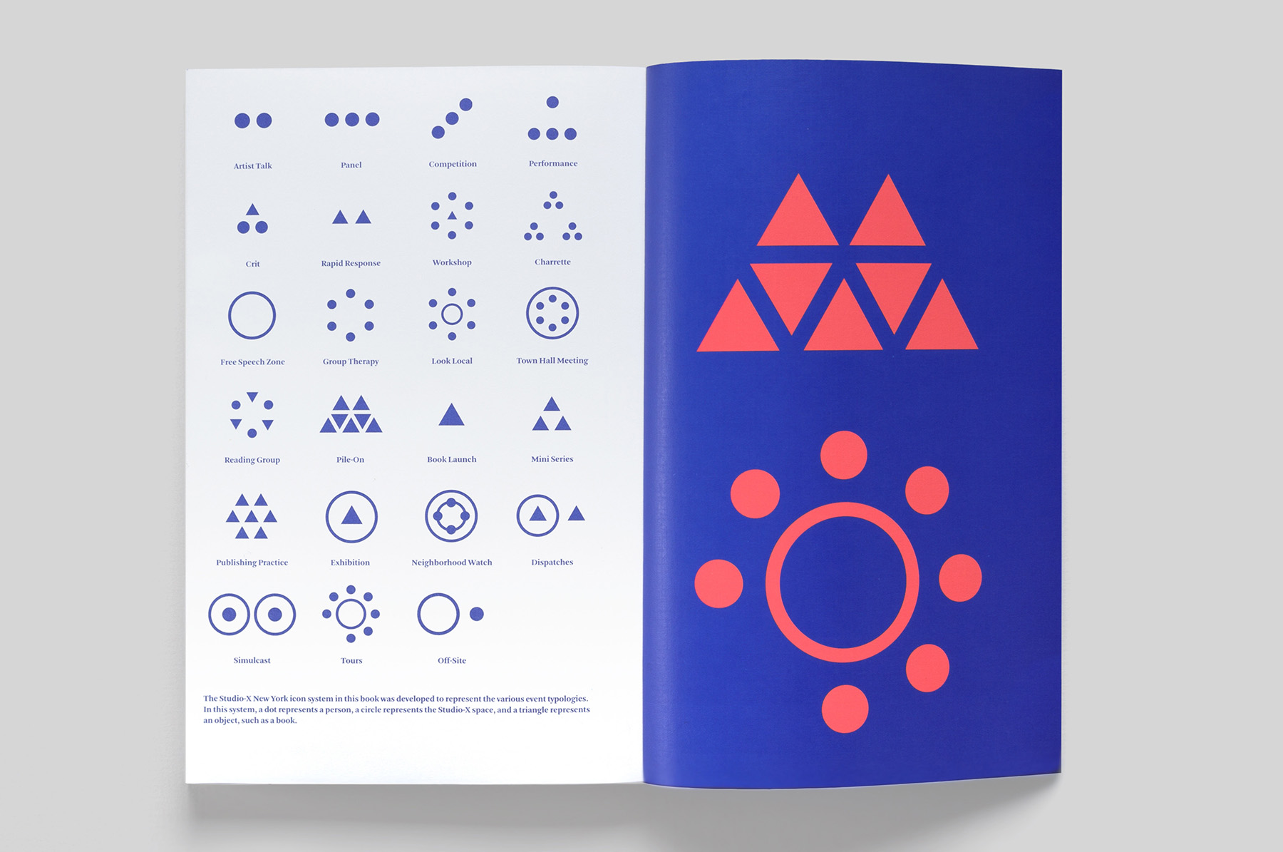
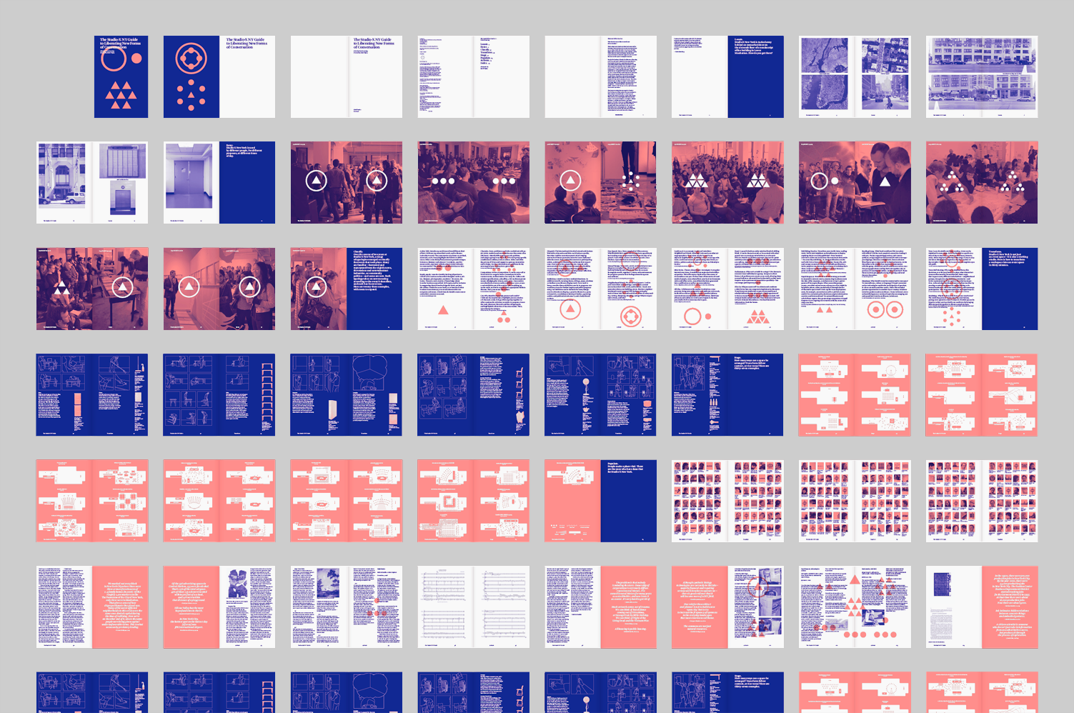
The Studio-X Guide frames the first two years of event programming at Studio X as a “How-To” guide for other cultural spaces.. The first half of the book describes Studio-X’s operations in multiple ways: through a typology of event types, a chronology of diagrams showing each events’s arrangement of chairs and tables, and a step-by-step guide to physically transforming a daytime office into an evening event space, among others. The second half of the book features new contributions from previous Studio-X participants and acts as a compendium to the original events rather than documentation of these proceedings.
MTWTF approached the design as a concatenation of disparate sections, each with its own visual approach. The goal was to paint a vivid picture but to leave ample room for interpretation rather than being comprehensive. An index of “event type” icons (Artist Talks, Panel Discussions, Competitions, etc., etc) are featured on the book’s final page offering a key to the shapes which are layered over each page of the book, and mark the event type referenced on each page.
The book was offset printed in dark blue and dayglo pink on white stock (front section) and gray stock (activate section) on an inexpensive press allowing it to retail for $15 in order to reach a wide audience.
Client: GSAPP Books
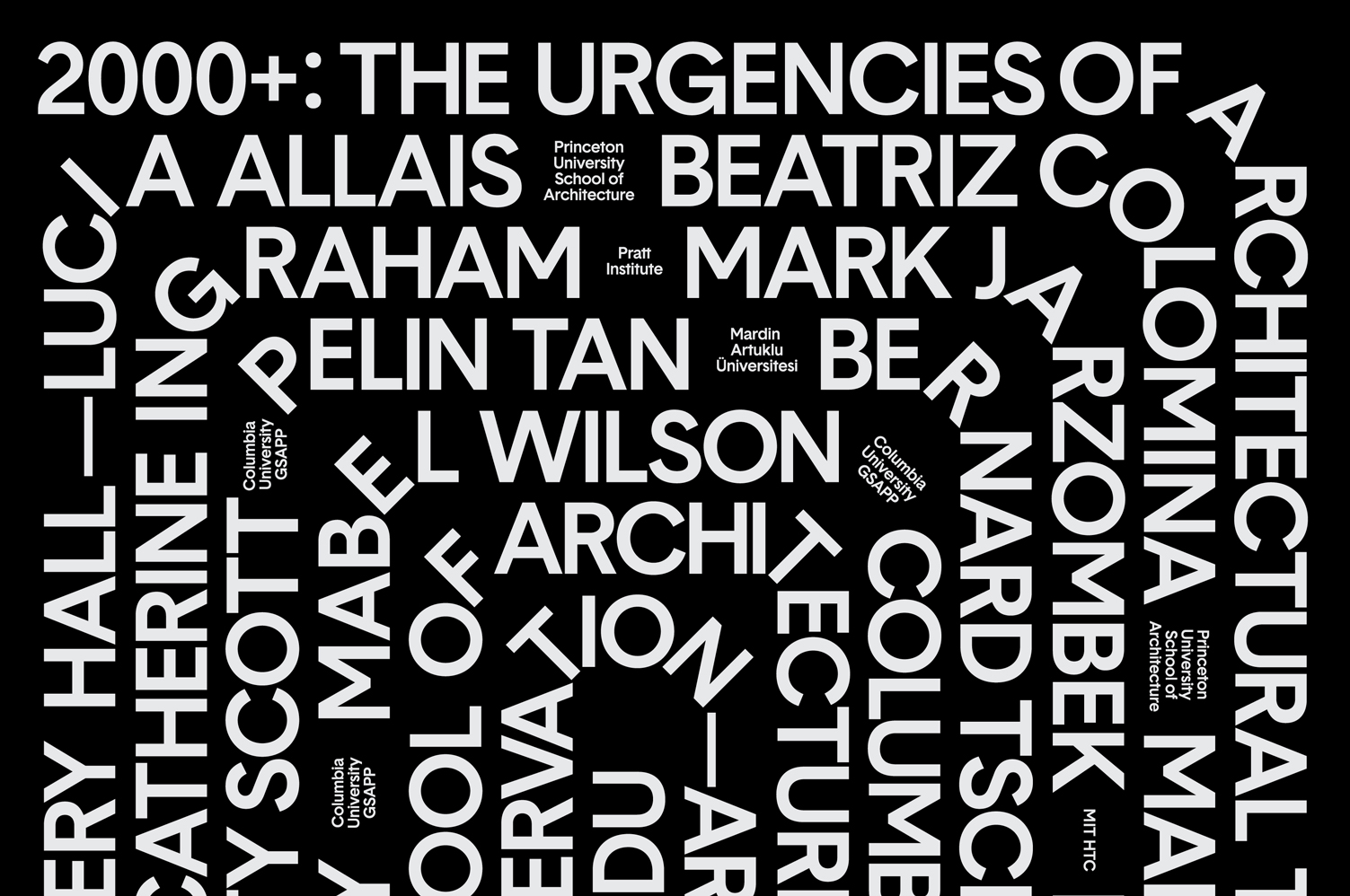
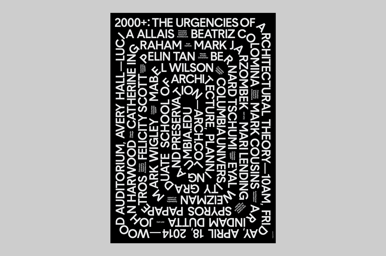
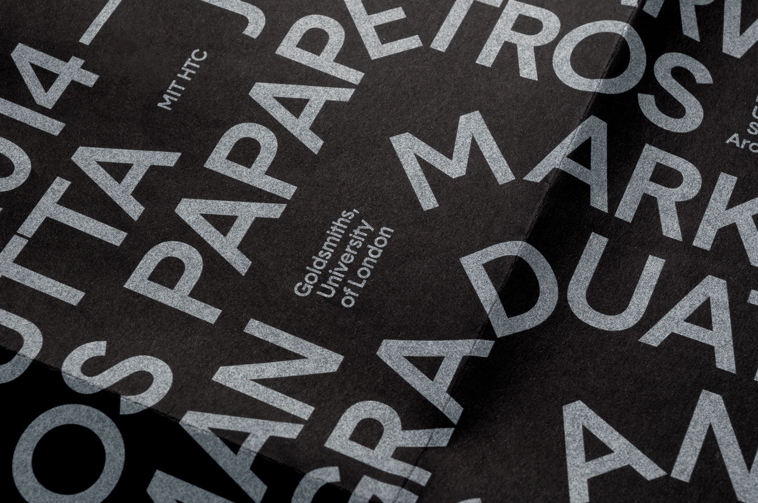
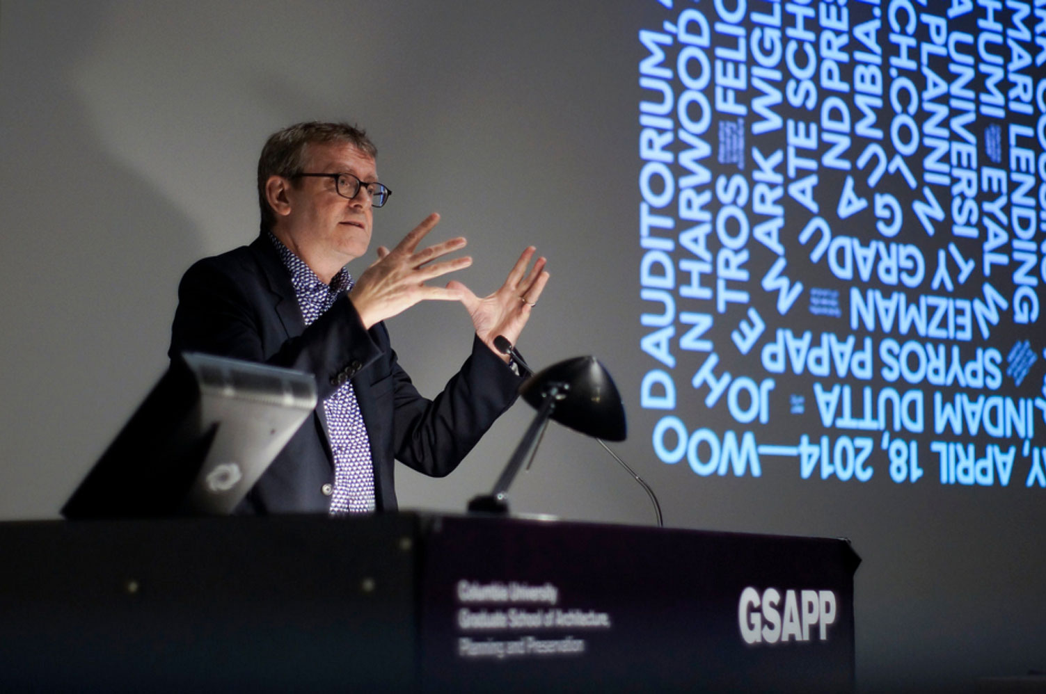
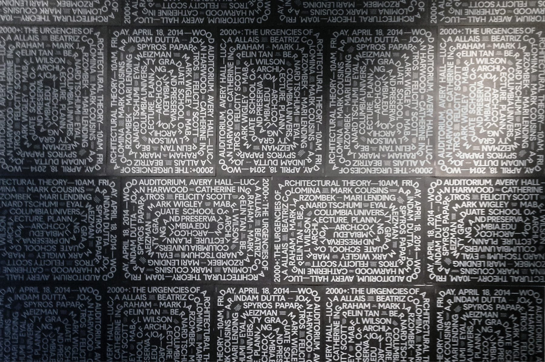
2000+: Urgencies of Architectural Theory Conference
MTWTF was commissioned to design a poster for 2000+: The Urgencies of Architectural Theory, a two-day conference convened by Dean Mark Wigley to consider the increasing relevance of theoretical discussion to contemporary architectural practice and pedagogy.
MTWTF designed a typographic poster which structures and visualizes its content as a single clockwise spiral. The poster is printed with two layers of white ink on black paper, a technique which calls attention to the organic quality of the paper’s surface.
The poster dislodges standard notions of orientation to a particular idea by providing a nonhierarchical visual form of multiple perspectives, entry points, and interpretations, inviting viewers to reorient themselves in relation to the content.
Client: Department of Events and Public Programs, GSAPP; Gavin Browning, Director
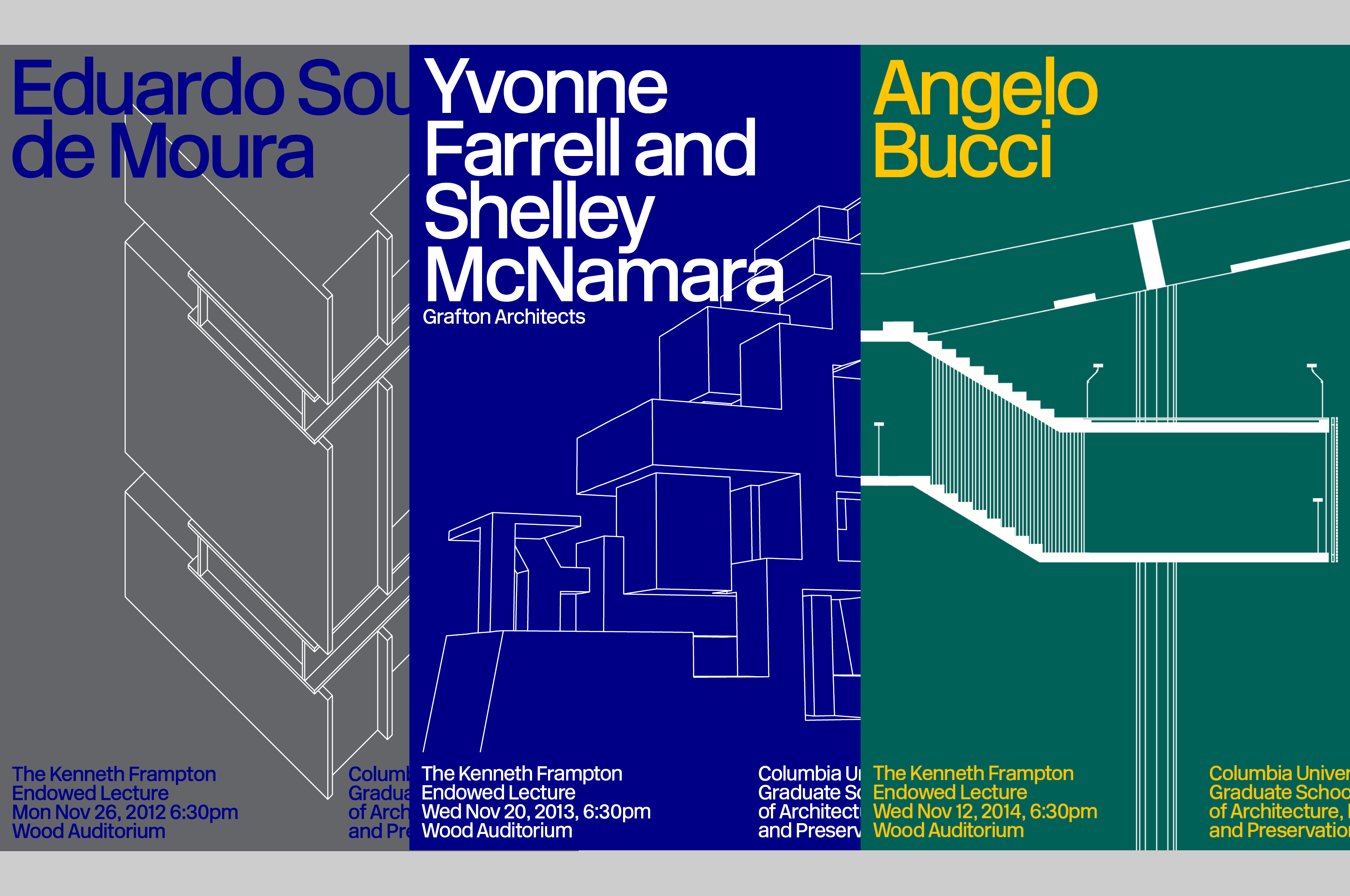
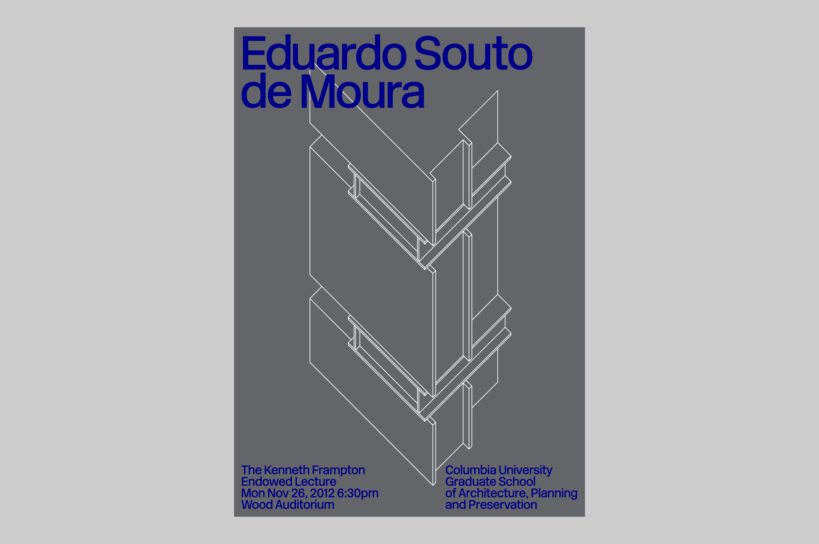
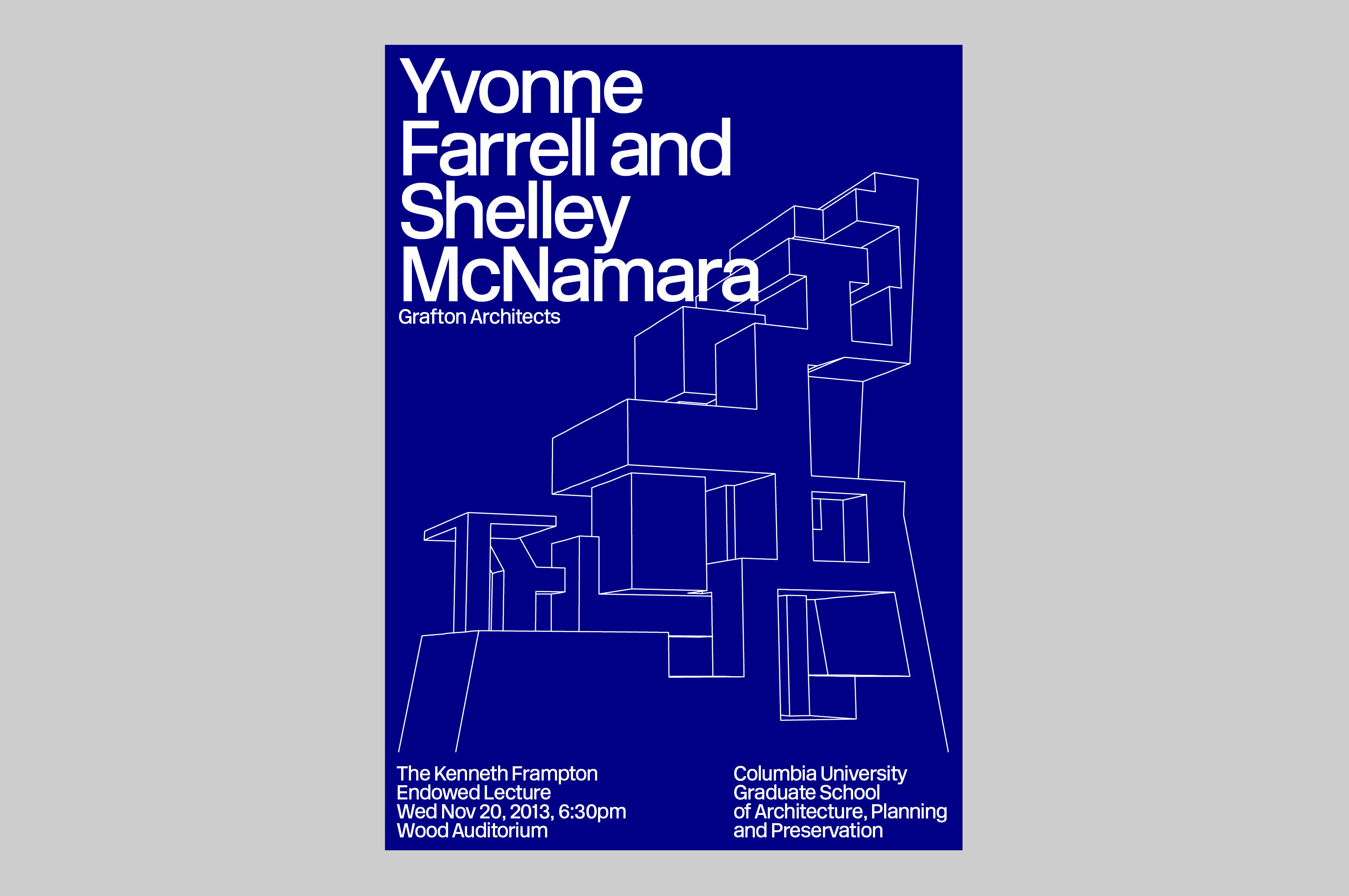
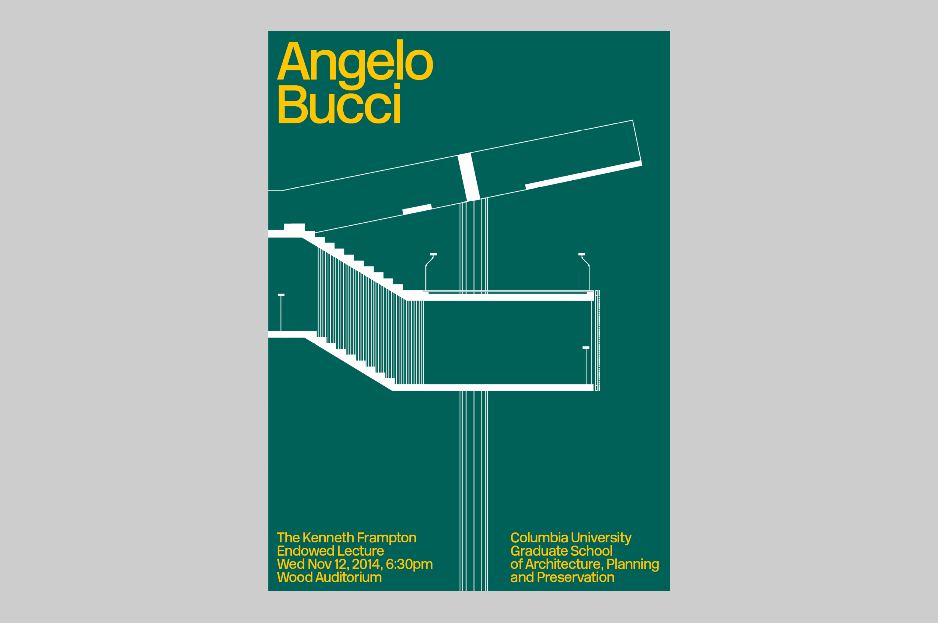
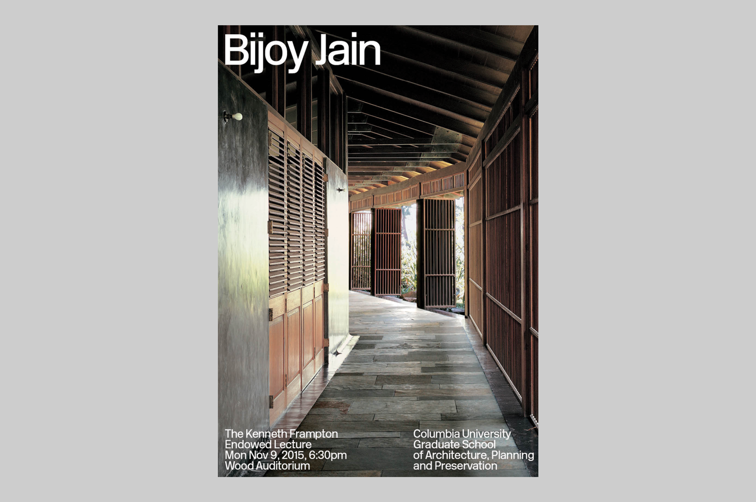
The Kenneth Frampton Endowed Lectures
Each year renowned historian Kenneth Frampton selects an architect or studio to deliver the Kenneth Frampton Endowed Lecture in Wood Auditorium; he also chooses a detail or view from one of the invitee’s built projects he feels is the most appropriate vis-à-vis his particular reading of their work.
In MTWTF’s posters, the detail acts as a synecdoche standing in for the entire building and representing a specific tectonic moment from the architect’s oeuvre. The posters attempt to work serially while incorporating various forms of drawing (e.g., axonometric, section, and perspective).
The design idea is to visually telegraph Frampton’s way of seeing by asking the viewer to think not only about the relationship between the type of drawing employed and its content, but also the detail selected and what sort of structural thinking or way of making it implies. Although the illustrations in each poster are visually related, they are equally diverse, speaking to a broad audience outside the discipline.
Client: Department of Events and Public Programs, GSAPP; Gavin Browning, Director
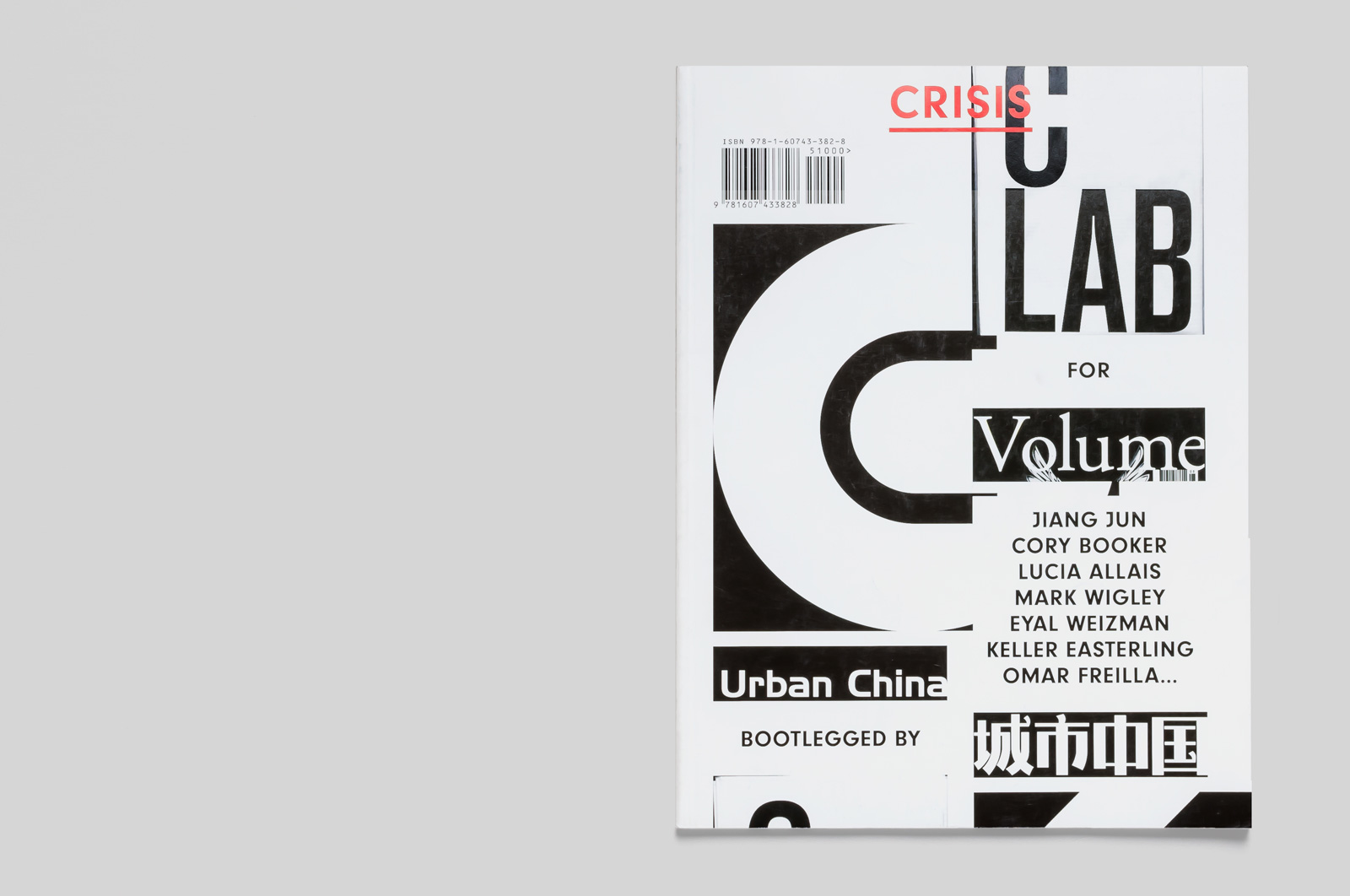
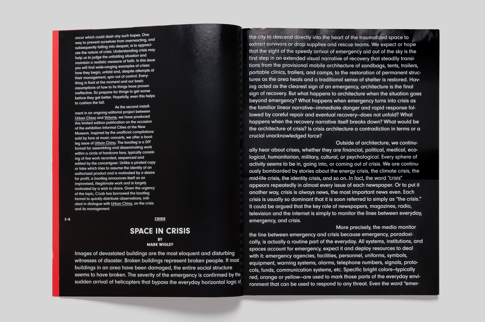
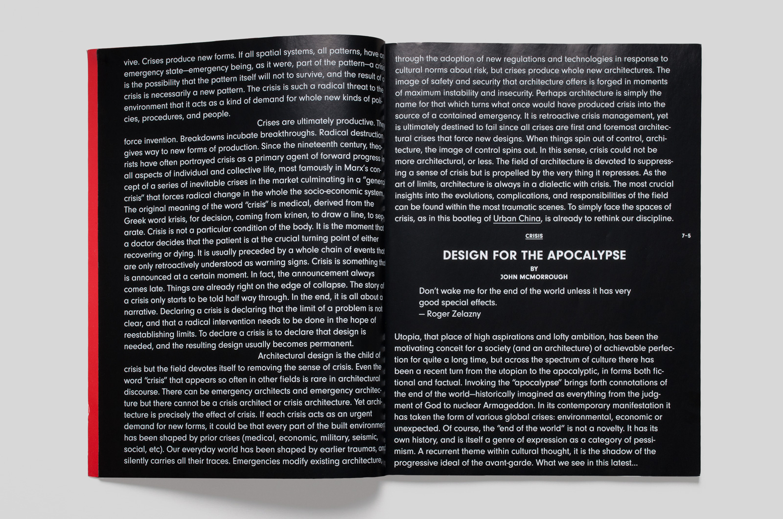
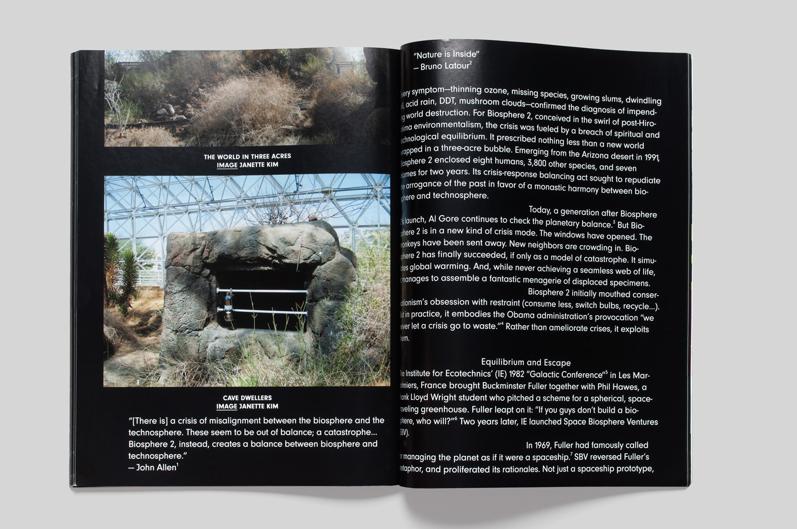
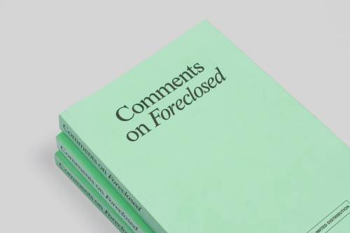
Crisis: Urban China bootlegged by C-Lab for Volume Magazine
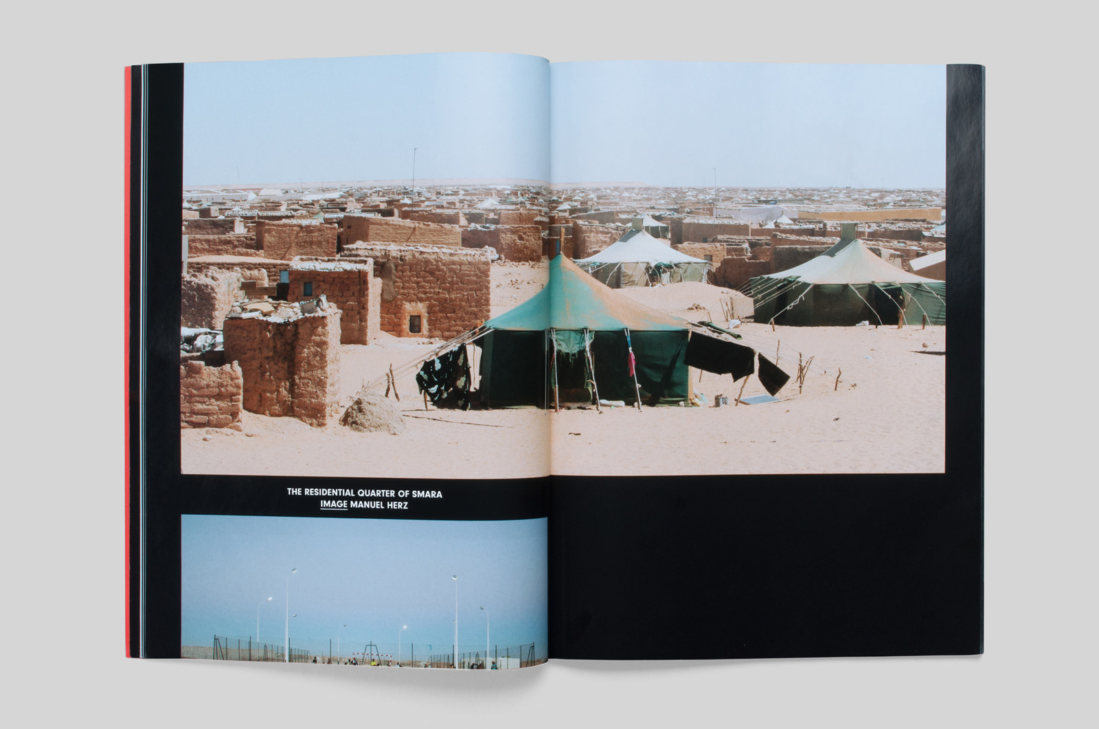
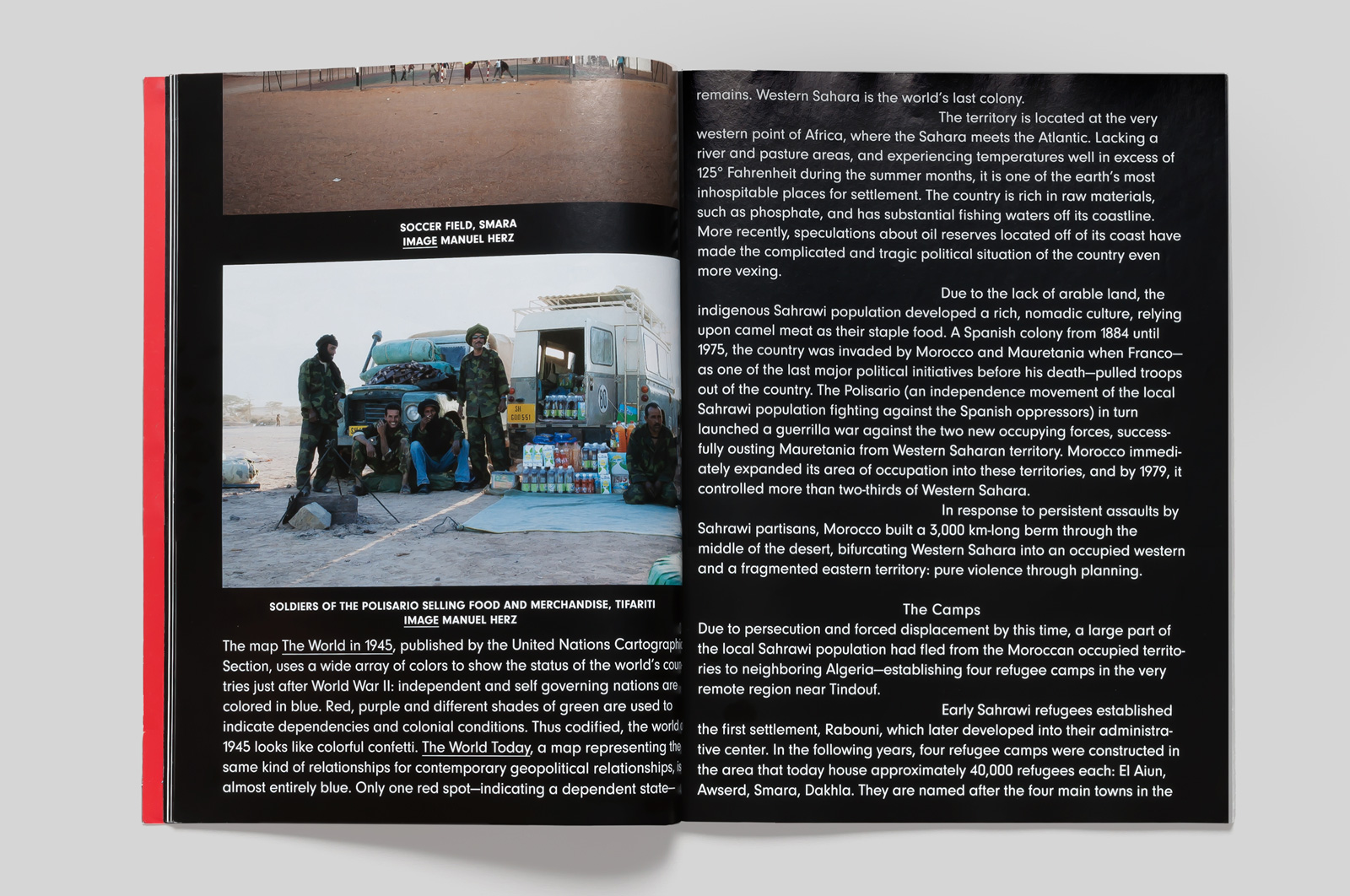
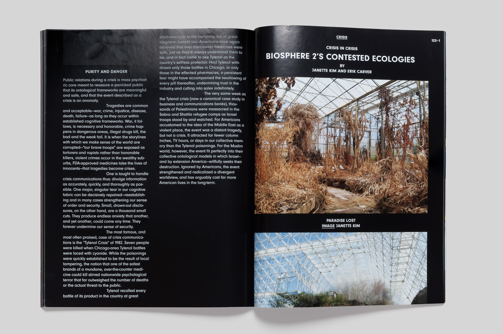
C-Lab (Columbia Laboratory for Architectural Broadcasting) commissioned MTWTF to design a bootleg, english language, edition of Urban China magazine to accompany the opening of the New Museum’s Informal Cities exhibition, a retrospective of the Chinese urbanism imprint. The project was inspired by the unofficial compilations and merchandise sold by fans at music concerts which celebrate the artists they love. The issue focuses on the topic of crisis, and presents architectural responses to urban emergencies; in addition to translated articles from Urban China, it features new contributions by Mark Wigley, Jiang Jun, Lucia Allais, Corey Booker, John McMorrough, Kazys Varnelis, Geoff Manaugh, Manuel Hertz, Jason Zuzga, and Janette Kim/Erik Carver.
Crisis is a perfect bound full-color magazine that presents its content as one continuous stream beginning on the cover and ending on its last editorial page. Articles and images, which have been pre-ordered and assigned levels of importance by the editors, are formatted and flown through the magazine’s columns, breaking in unlikely ways across pages and spreads, much in the way that printed emails and websites break across 8.5 x 11 sheets of paper. The result is a compositional language that conveys provisional urgency.
MTWTF recognized an opportunity in expediency by conflating the challenges of (1) creating a nuanced one-off publication design appropriate to Crisis and (2) completing the project under a hyper-compressed schedule. By devising a workflow which radically reduced the design time and resulted in an unusual visual language that appears provisional, MTWTF was able to solve one challenge with the other, producing what senior editor Jeffrey Inaba aptly described as “a publication in crisis.”
Content Development: C-Lab
Editor: Jeffrey Inaba
Managing Editor: Gavin Browning
Production Coordination: Jin Jung
Further Reading: Archinect